
Hot Dog Seattle: E-commerce Website Design with WordPress & Elementor
Project Gallery
The context
Hot Dog Seattle is a fast-casual brand with a strong visual identity and a menu built around customisation. Ordering in person is quick and social. Ordering online, on their previous setup, was neither.
Food ordering has a particular constraint that most e-commerce does not: people are usually hungry, often standing up, and almost always on a phone. Every extra tap costs you an order. The design problem was compressing a customisable menu into something you can complete one-handed.
Design decisions
Mobile first, and not as a figure of speech. The phone layout was designed first and the desktop version derived from it. For a food brand, desktop is the edge case.
Customisation modelled on the counter. Choosing toppings online tends to become a long form. I structured it the way ordering in person works: pick the item, then adjust it, with the running price visible throughout so nobody is surprised at checkout.
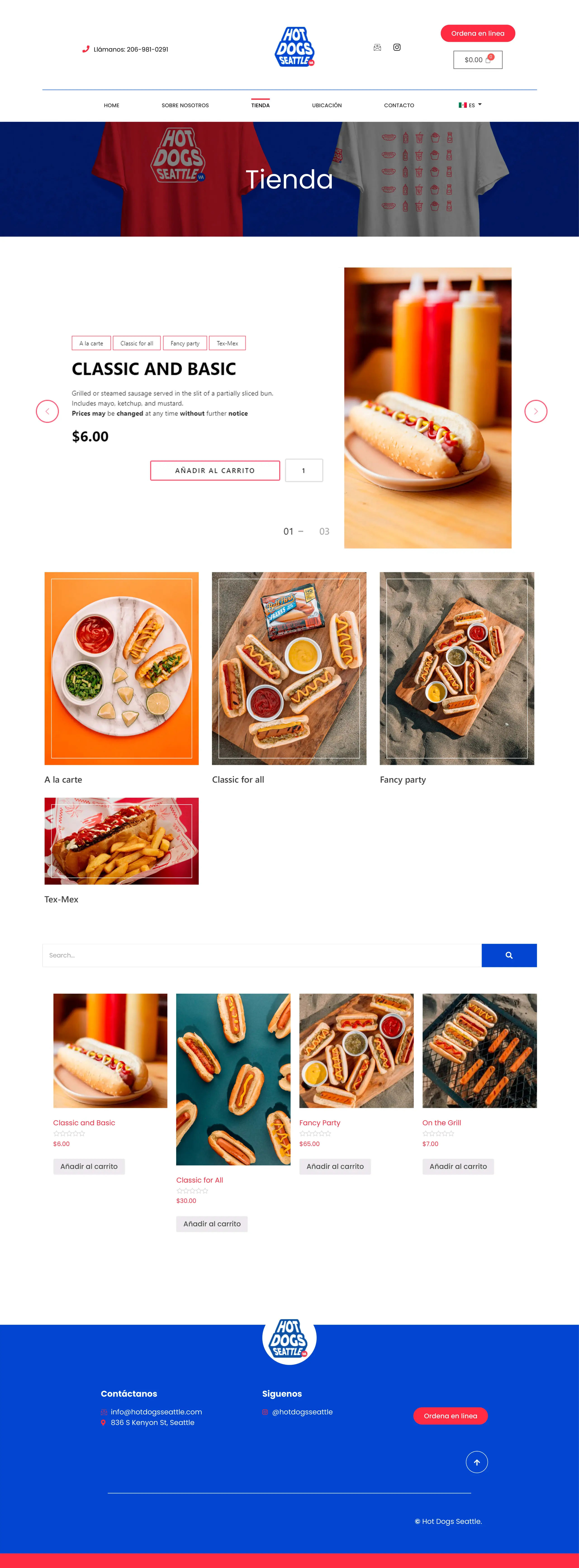
Photography doing the selling. Food is bought with the eyes. The menu grid gives each item a large image and gets the interface out of the way, with product names and prices as the only competing elements.
A checkout with no detours. No account creation, no upsell interstitials. Cart, details, pay.
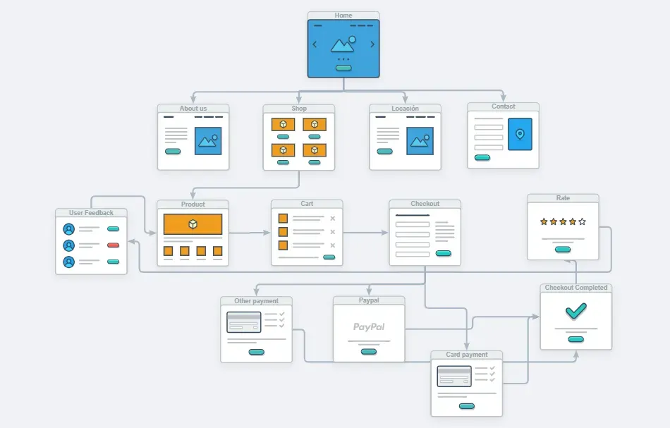
The flow
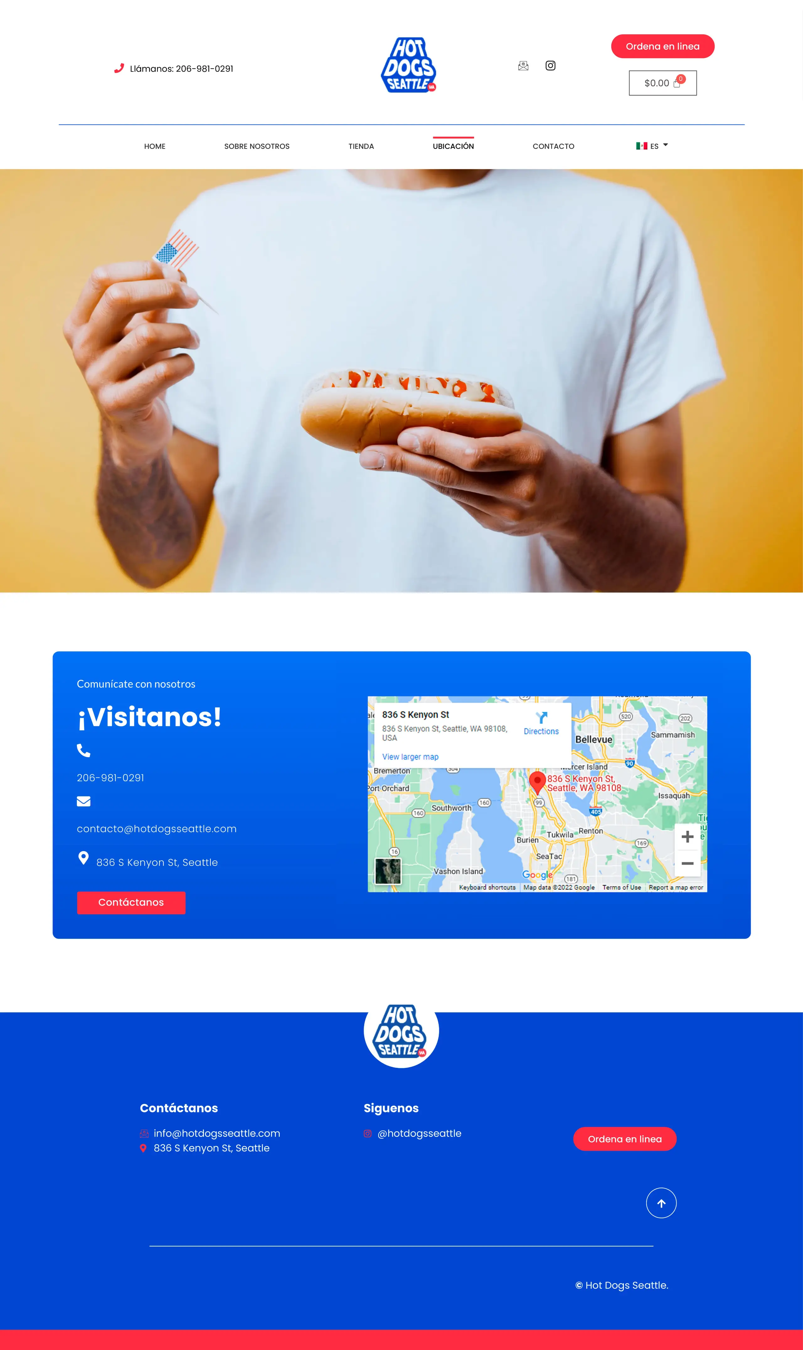
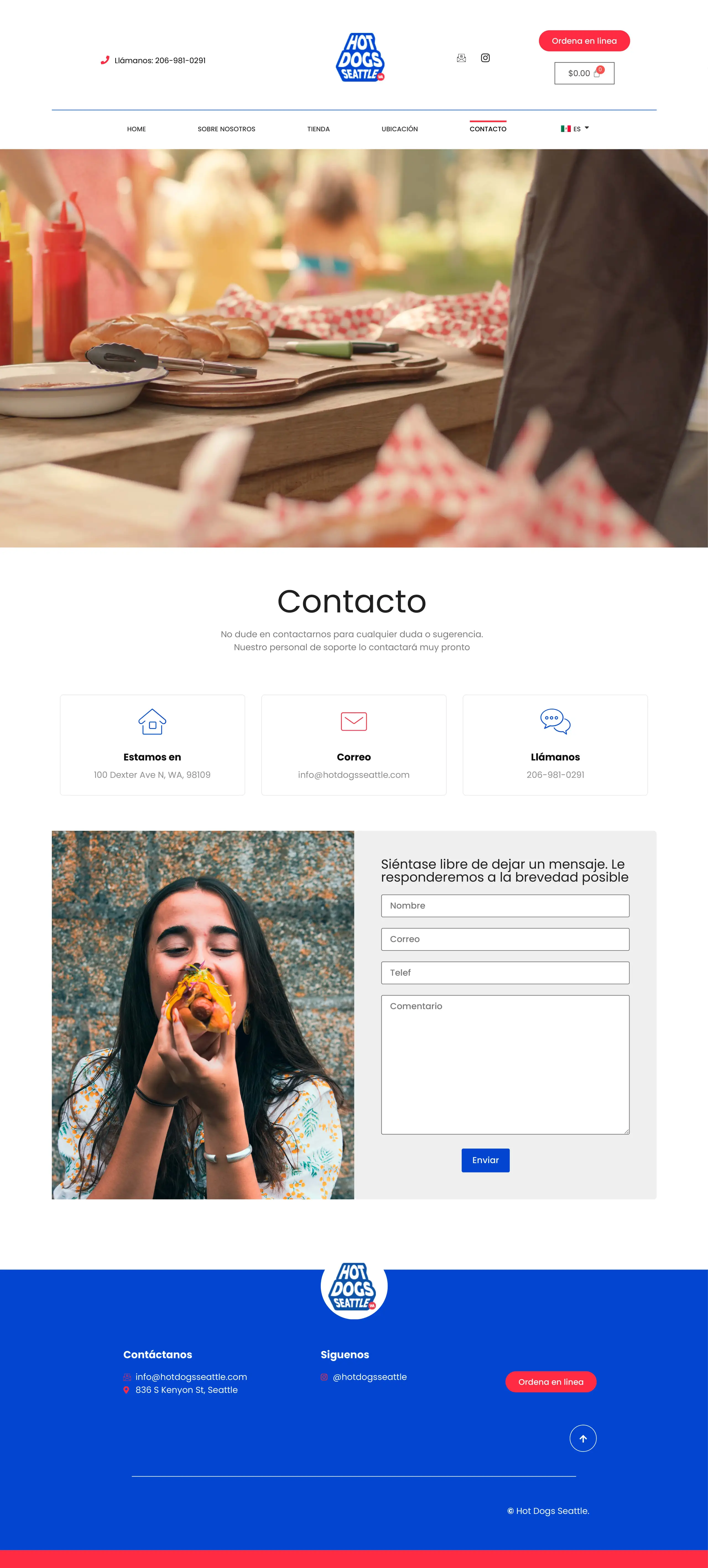
The site map is deliberately shallow. From the home page, four destinations: about, shop, location and contact. Nothing is more than two taps from the menu, which keeps crawl depth low for search engines and cognitive load low for customers.
Through the funnel:
- Product pages carry reviews, because social proof does more work for food than description does.
- The cart shows the order clearly enough to check before committing, which is where most abandonment happens.
- Checkout offers card, PayPal and local methods, since limiting payment options in a local food business loses real orders.
- After the sale, a rating prompt feeds reviews back into the product pages.
Stack
WordPress with Elementor Pro for the front end, on a lean build: native containers, no page-builder add-ons, and images exported as WebP at display size.
That last part matters more here than on most sites. A hungry customer on mobile data will not wait four seconds for a menu to load, and food photography is exactly the kind of asset that gets shipped unoptimised.
Result
The client moved from taking orders by phone and message to a storefront that handles them, and can update the menu seasonally without a developer.
Running a local food business?
Online ordering fails on friction far more often than on design. If yours is losing customers between the menu and the payment screen, that path is worth mapping.