
Expansion Works: Professional Web Design for Executive Coach
Project Gallery


The bottleneck
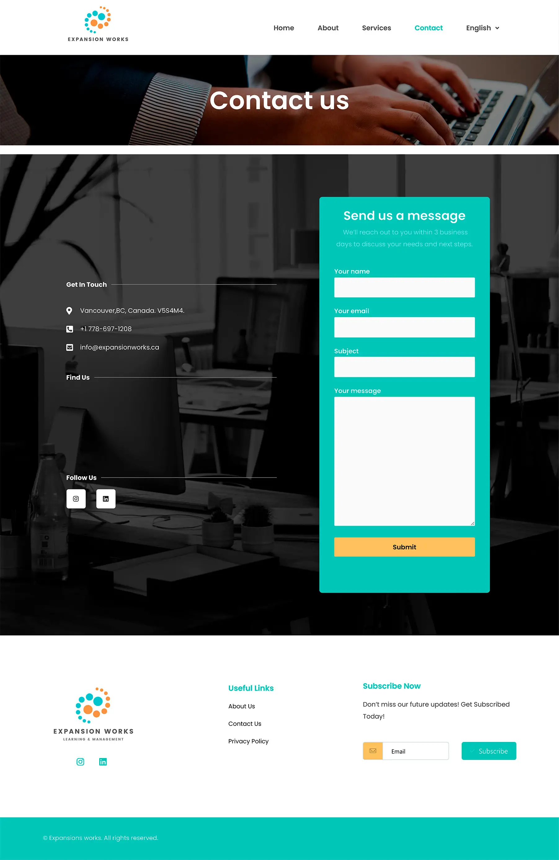
Expansion Works is a one-person executive coaching practice. The founder was losing prospects at a specific point: someone would read the site, decide they were interested, fill in a contact form, and then wait. She would reply, they would negotiate times over email, and a meaningful number of those threads went cold before a call ever happened.
The website was not the problem. The gap between interest and a booked call was.
What I did about it
I removed the contact form from the conversion path. The site embeds Calendly directly, so someone who decides they want a call can see real availability and book it without leaving the page. That collapses a multi-day email exchange into about forty seconds.
The form still exists for people with questions that are not “when can we talk”. It is just no longer the only door.
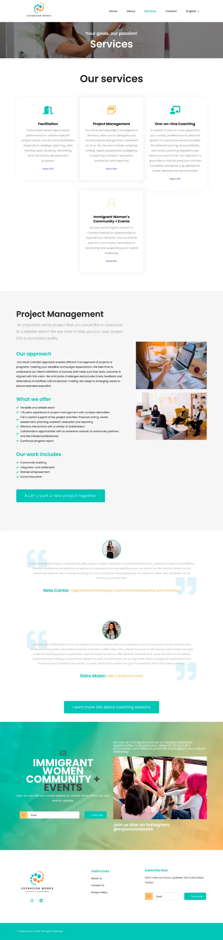
I designed for skim-reading. Her audience is senior people reading between meetings. Every section leads with the conclusion and supports it underneath, so someone who reads only the headings still gets the argument.
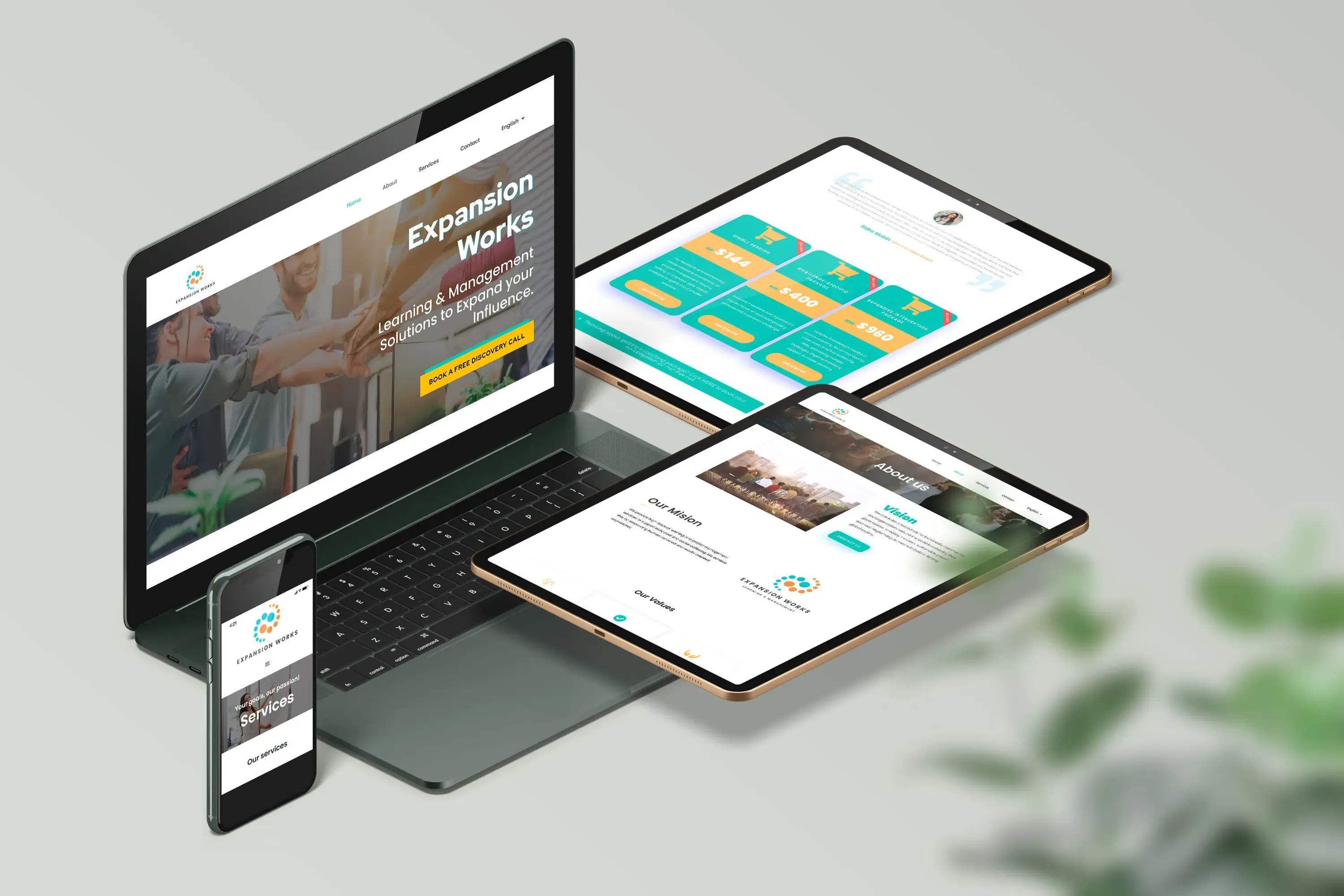
I kept the visual language restrained. A soft palette and a single typeface family with a clear weight hierarchy. For high-value services, visual noise reads as insecurity, and the credibility has to come from the structure rather than from decoration.
The path through the site
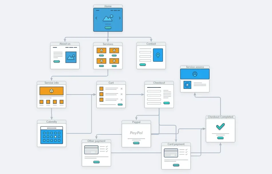
The architecture has four stages, each answering the question the previous one raises:
- Home establishes who she works with and what changes.
- About answers whether she is credible, which for a solo practice means the person, not the company.
- Services sets out the packages side by side so they can be compared without hunting.
- Booking takes the decision while it is still warm.
There is also a private area where existing clients reach their session materials, which keeps the public site focused on one job.
Stack
Built on WordPress with Elementor Pro, from scratch rather than on a purchased theme. Calendly is embedded via its native integration, so availability stays in sync with her actual calendar with no manual updating.
The site is bilingual, and the layout was tested at each breakpoint rather than left to automatic stacking, since a booking widget that breaks on a phone defeats the whole point.
Result
The booking step went from a multi-message exchange to a single interaction, and the client manages her own availability without touching the site.
Selling a high-value service?
The friction is usually not in the design. It is in the number of steps between someone deciding and someone acting. That is worth mapping before redesigning anything.