
Dana Shape: Shopify E-commerce Website Design for Shapewear Brand
Project Gallery
The category problem
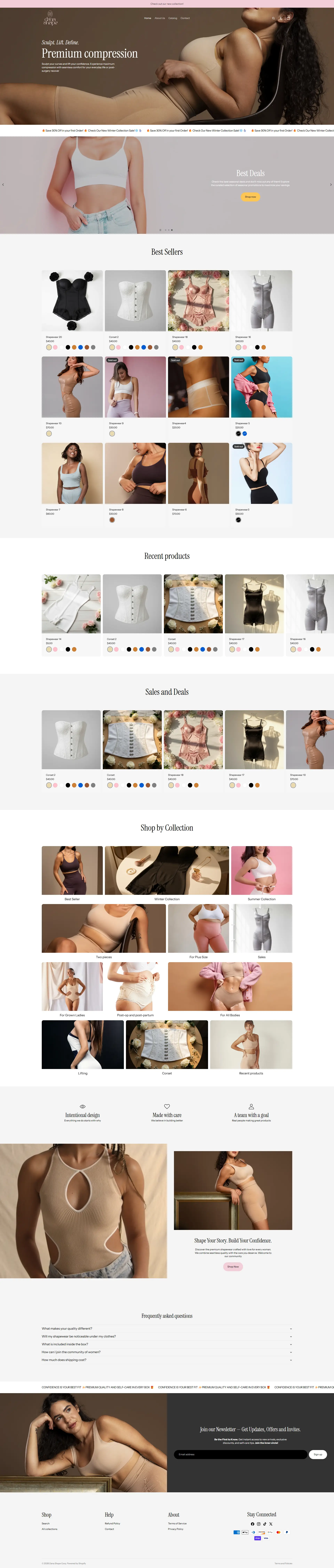
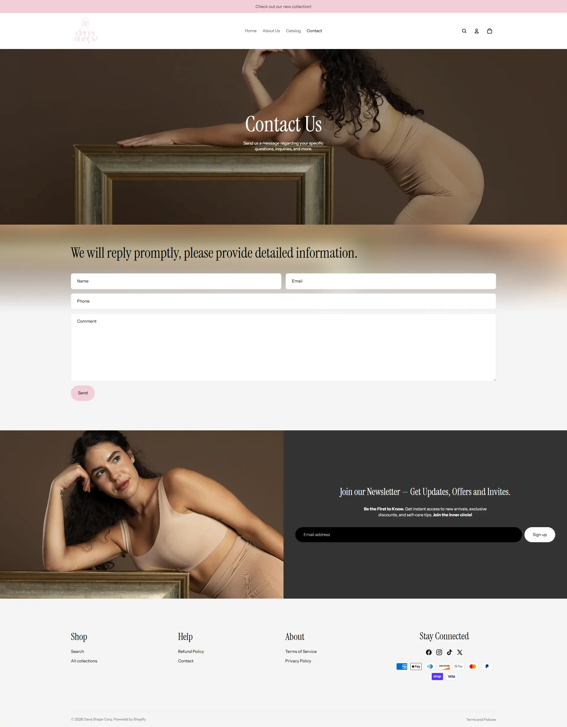
Shapewear sites tend to look clinical. Beige backgrounds, technical diagrams, language borrowed from medical supply catalogues. It is an odd fit for a product people buy to feel good, and it makes the whole category feel slightly apologetic.
Dana Shape wanted to sell the same product without that framing. The task was building a store that reads like a boutique rather than a pharmacy, while keeping the practical information a fit-dependent purchase requires.
What that meant in practice
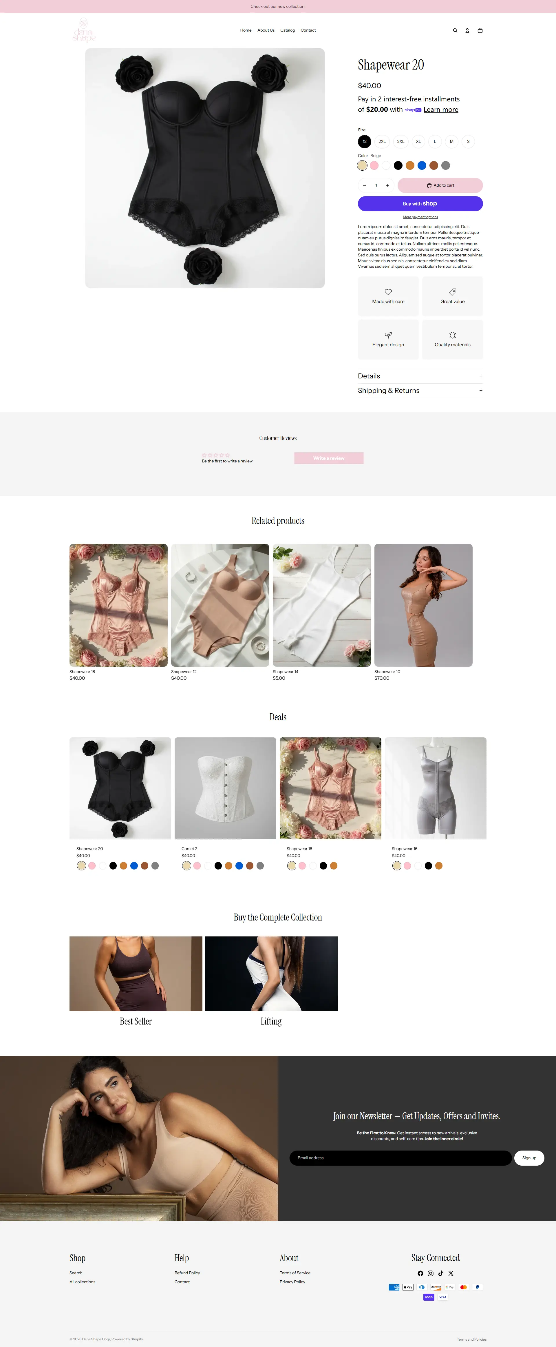
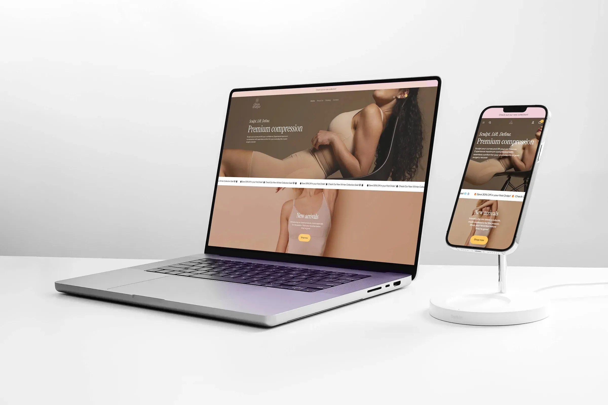
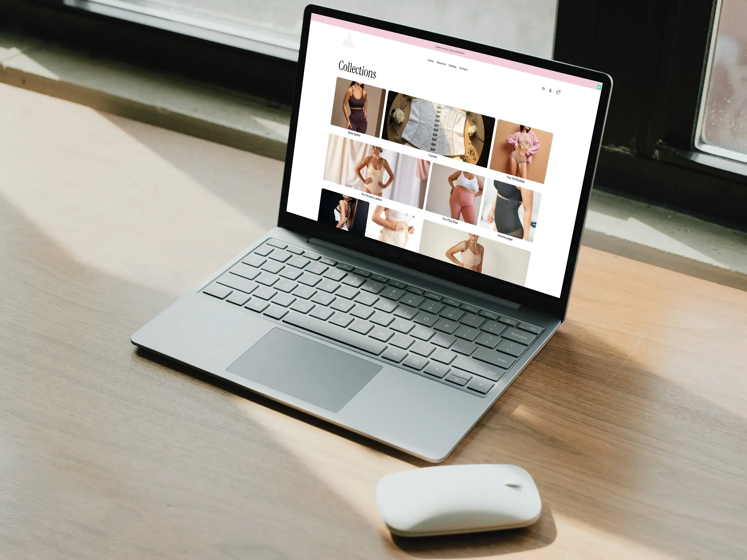
Photography over diagrams. The product is shown worn, at scale, with the interface receding. Sizing detail is still there, but it lives inside the product page rather than dominating the catalogue.
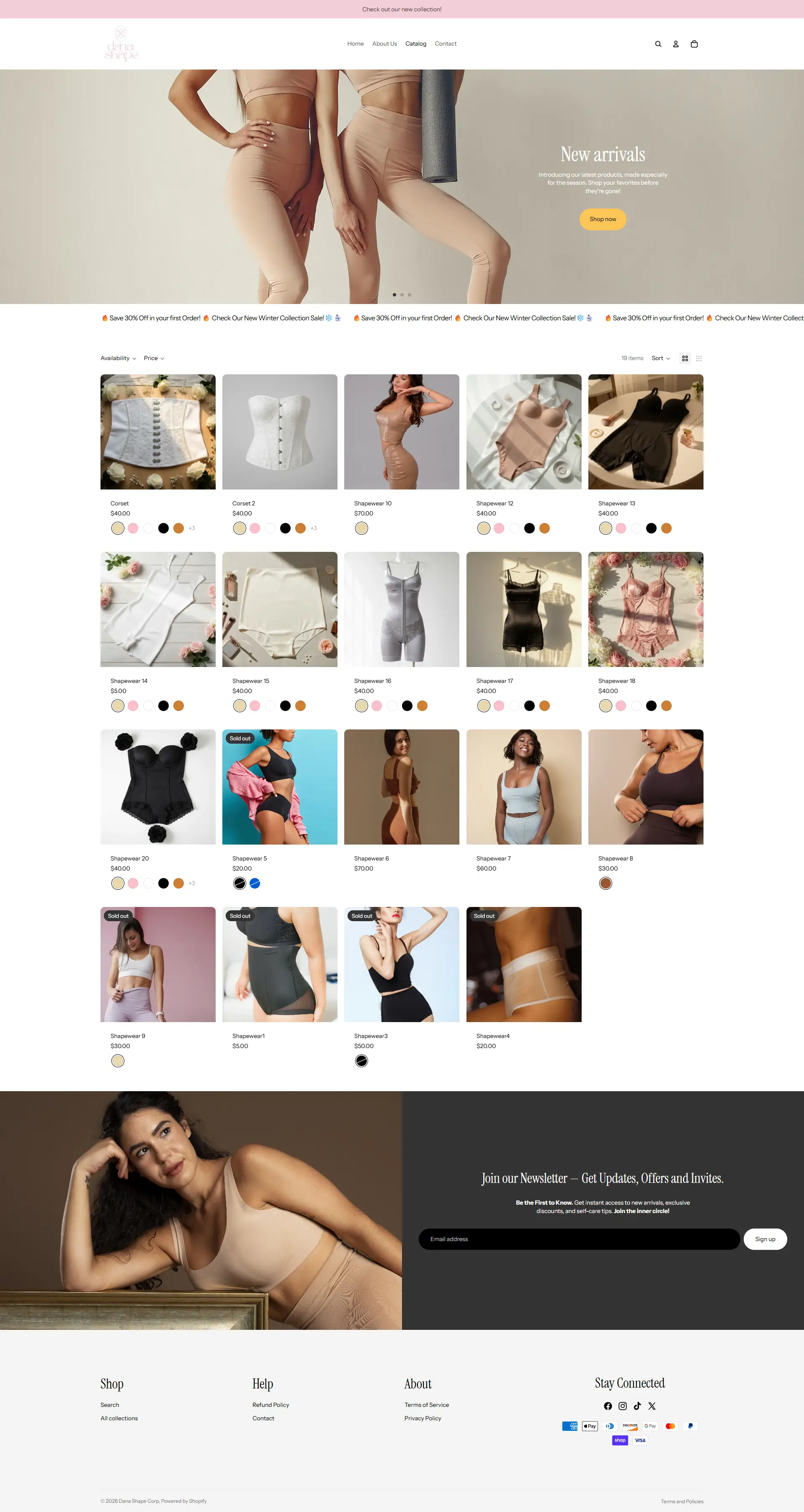
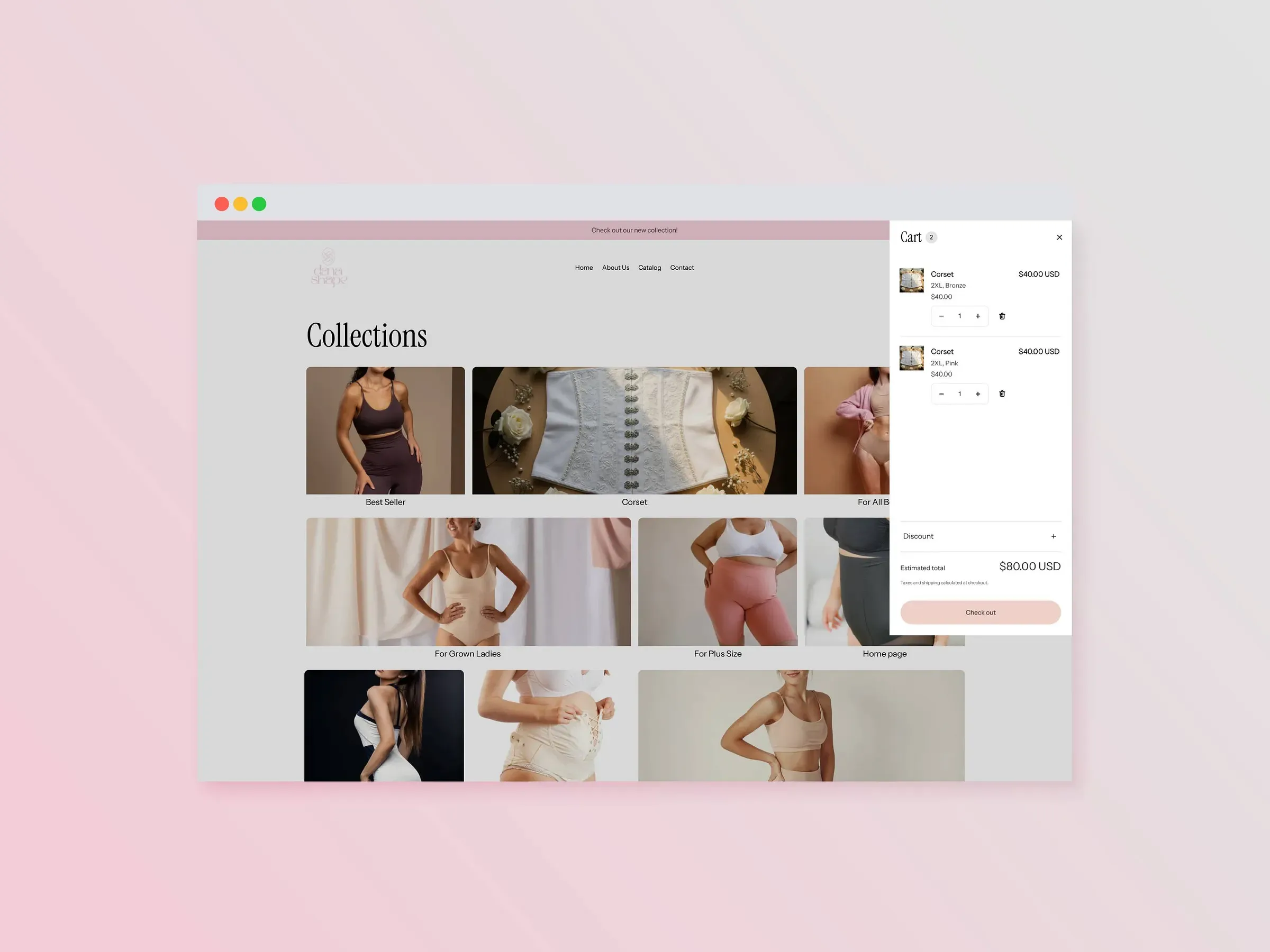
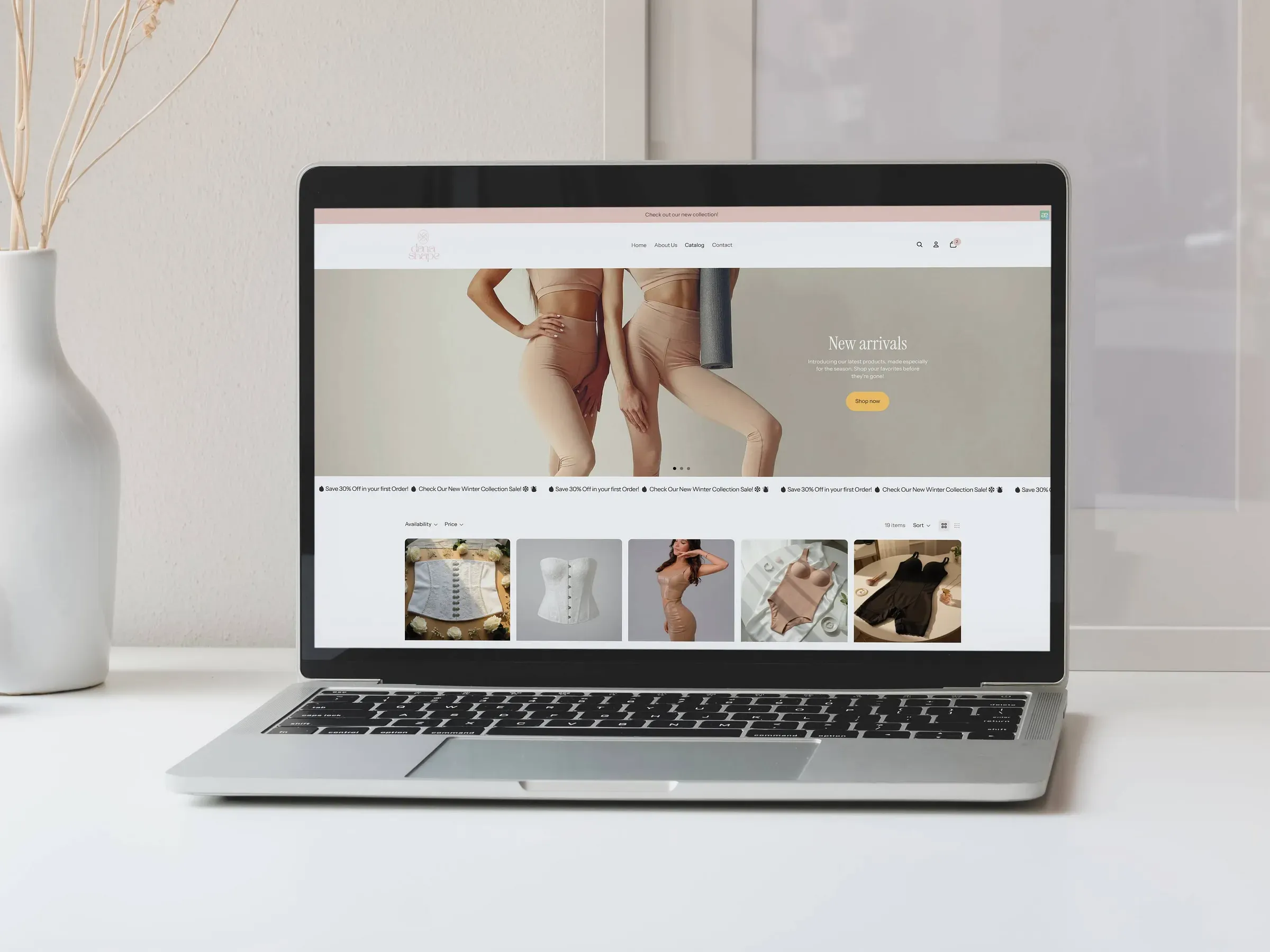
Filtering organised around fit, not SKUs. Customers shopping this category are solving a specific problem, so the filters use their language rather than the internal product taxonomy.
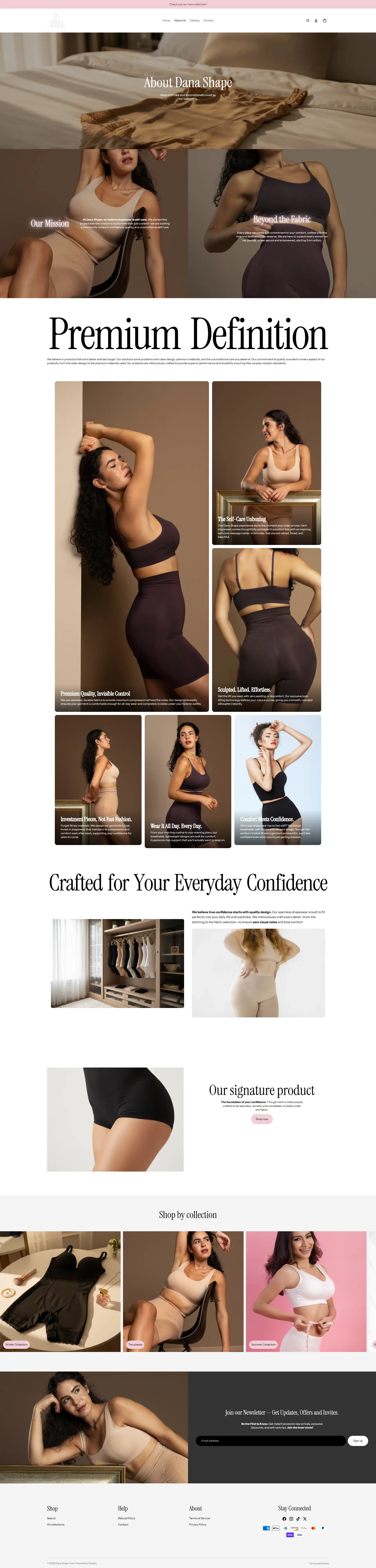
A five-page architecture, deliberately. Home, about, catalogue, product, contact. Each has one job. Extra pages in a small store dilute the path to purchase and give search engines thin content to index.
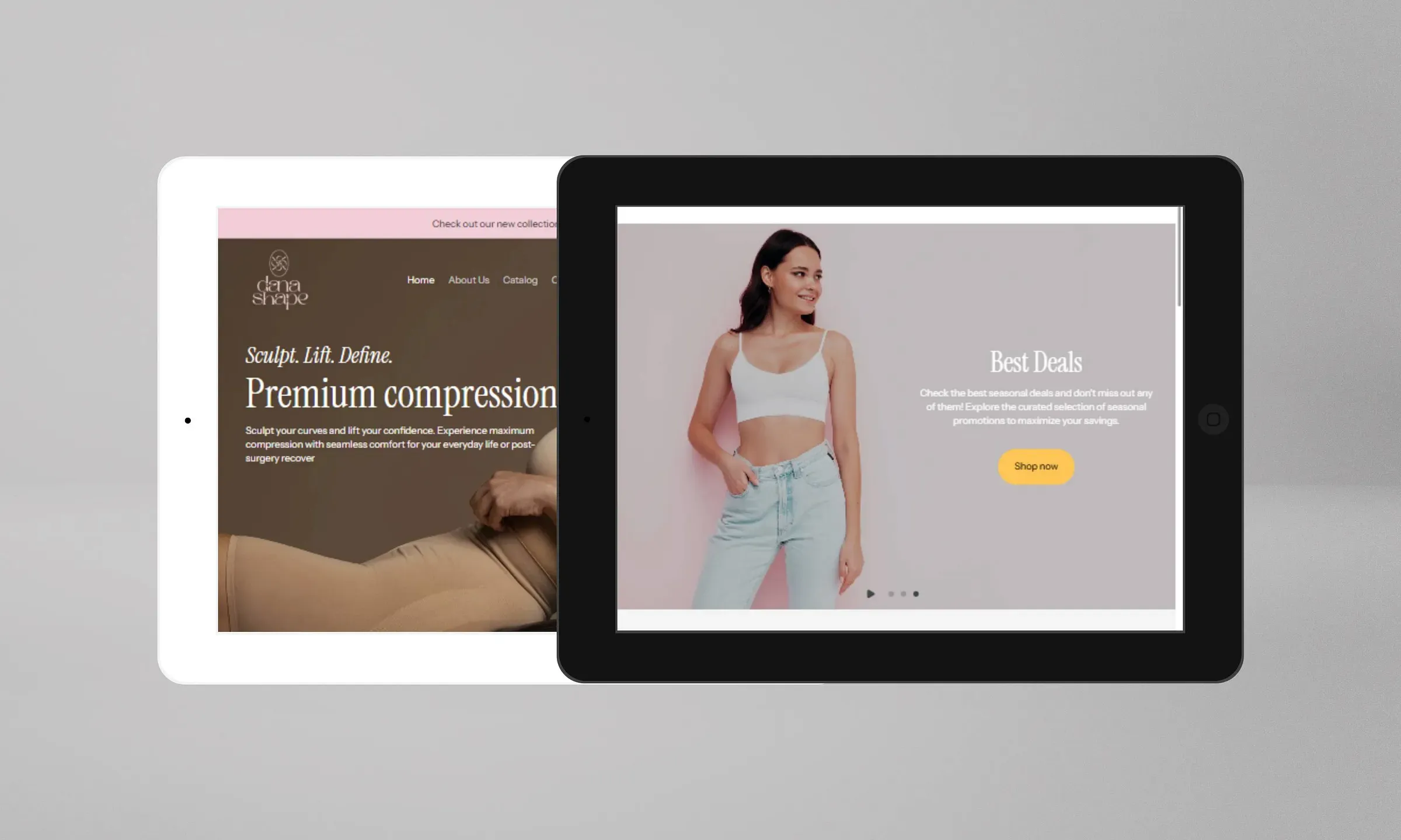
Neutral palette, one typeface family. Restraint here is functional. When the interface is quiet, the product photography carries the emotional weight, which is exactly where it should sit.
The wireflow came first
I mapped the full journey before designing a screen, because the failure point in this category is predictable: someone finds a product they like, cannot work out their size, and leaves.
The flow addresses that directly. Sizing guidance sits at the moment of doubt rather than on a separate page nobody visits, and the product page answers the fit question before it asks for the sale.
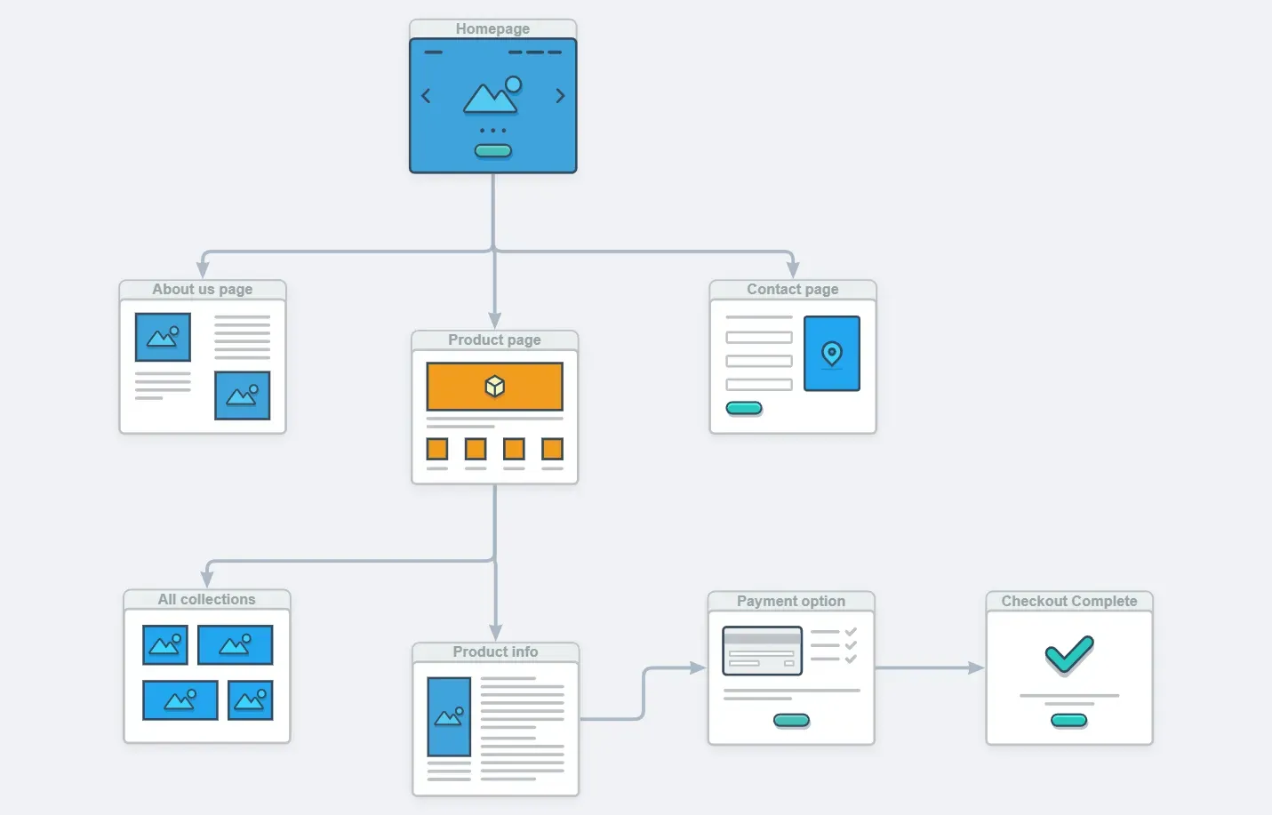
Four stages:
- Landing establishes the brand’s tone and surfaces featured products.
- Navigation leads into the catalogue with filtering that narrows quickly.
- The product page resolves fit and shows the item at real scale.
- A single, unambiguous purchase action.
Stack
Built on Shopify, which handles inventory, payments and fulfilment without custom backend work. For a brand at this stage, that is the right trade: less control over the checkout, far less operational overhead.
Product photography was processed with compression tuned per image rather than a blanket setting. Fashion imagery is the heaviest thing on a store like this, and the difference between a considered export and a default one is measured in seconds of load time on mobile.
Micro-interactions were kept to state changes: hover, selection, cart feedback. Enough to make the interface feel responsive, not enough to slow it down.
Result
A storefront the brand can run without a developer, with a catalogue that scales as the range grows.
Building a Shopify store?
The design work that matters usually happens before the visuals: mapping where people hesitate and answering it there. Get in touch if that is where yours is stuck.