
CotizaGuate: Brand Identity, 3D Mascot and WooCommerce Build
Project Gallery
The brief
CotizaGuate compares what Guatemalan retailers charge for the same electronics. The commercial problem was not the comparison engine, it was recognition: this is a category where every competitor looks like a spreadsheet with a logo on top, and nobody remembers a spreadsheet.
So the work started with identity rather than interface. Three pieces, usually split across three suppliers: the mark, a character, and the storefront the whole system would live on.
Building the mark around a letter
The starting point was the quetzal, Guatemala’s national bird and, conveniently, the name of the currency. Both meanings are in play here, which is exactly the kind of coincidence worth designing around.
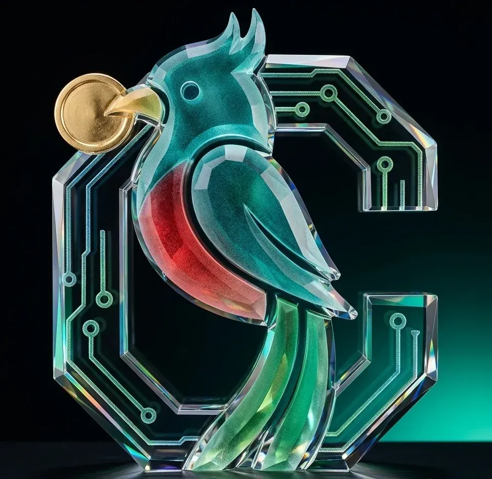
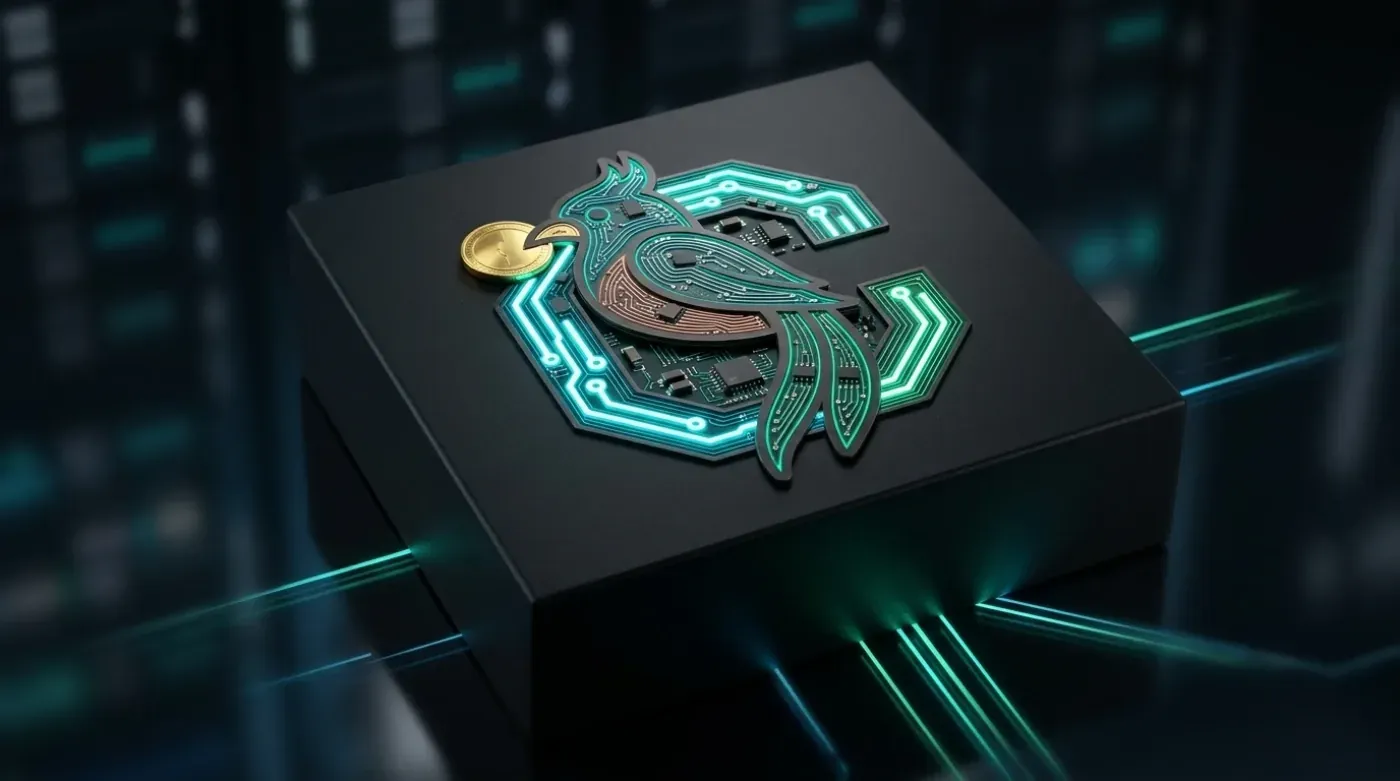
Rather than setting the bird beside the name, I built it into the C of Cotiza, with circuit-board tracing forming the letterform. It reads as a monogram first and gives up the bird second.
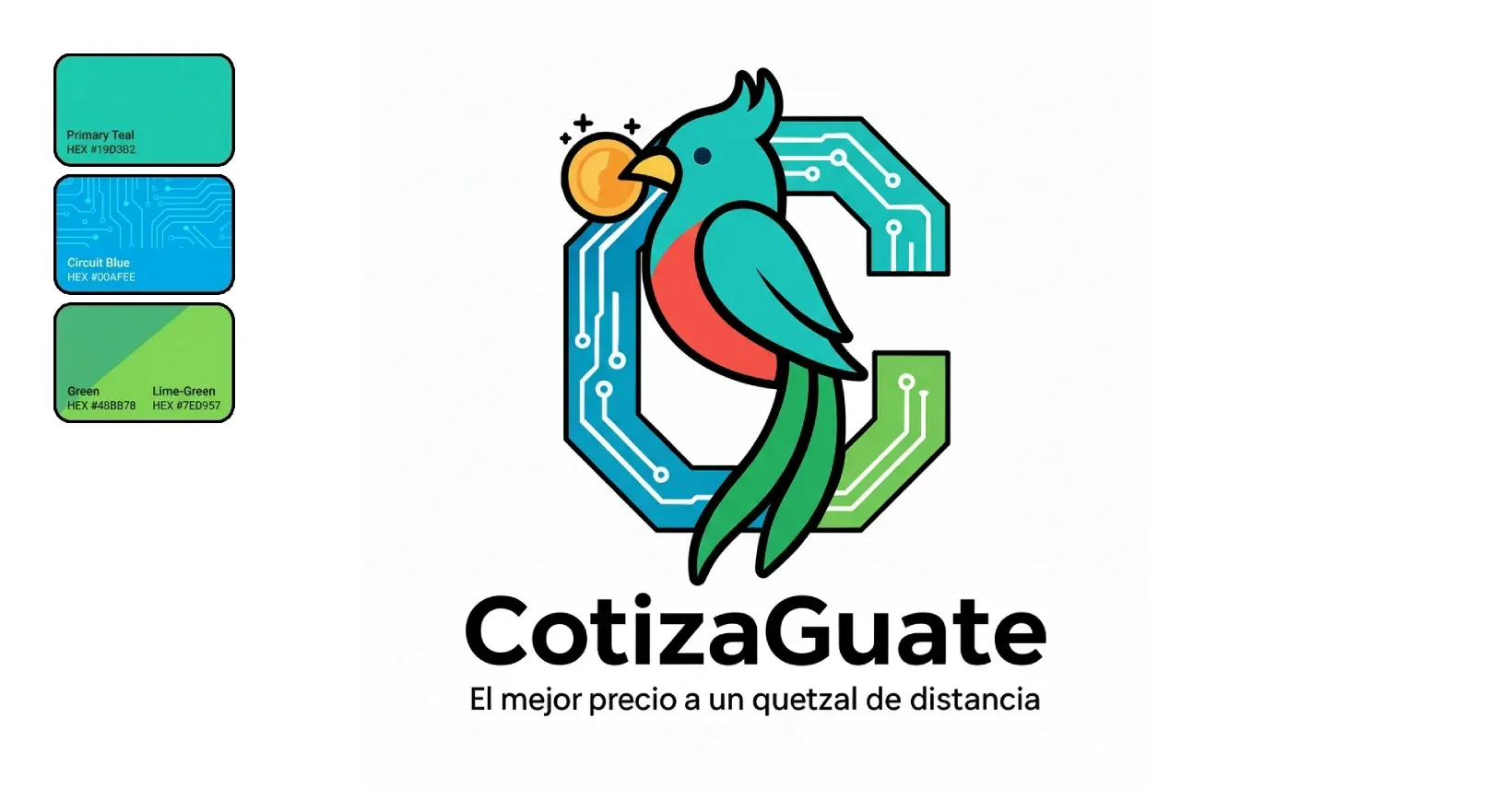
That decision came from where the mark actually has to survive. A comparison platform lives at 16 pixels, in favicons, app icons and partner listings. An illustrated bird turns to mush at that size. A letter with a silhouette inside it does not.
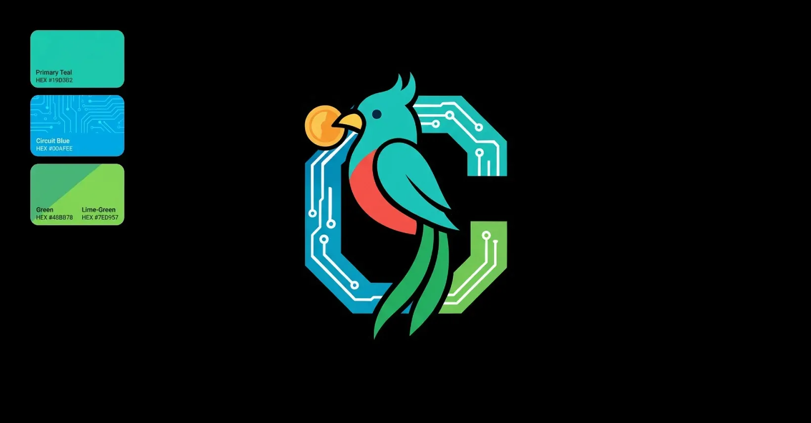
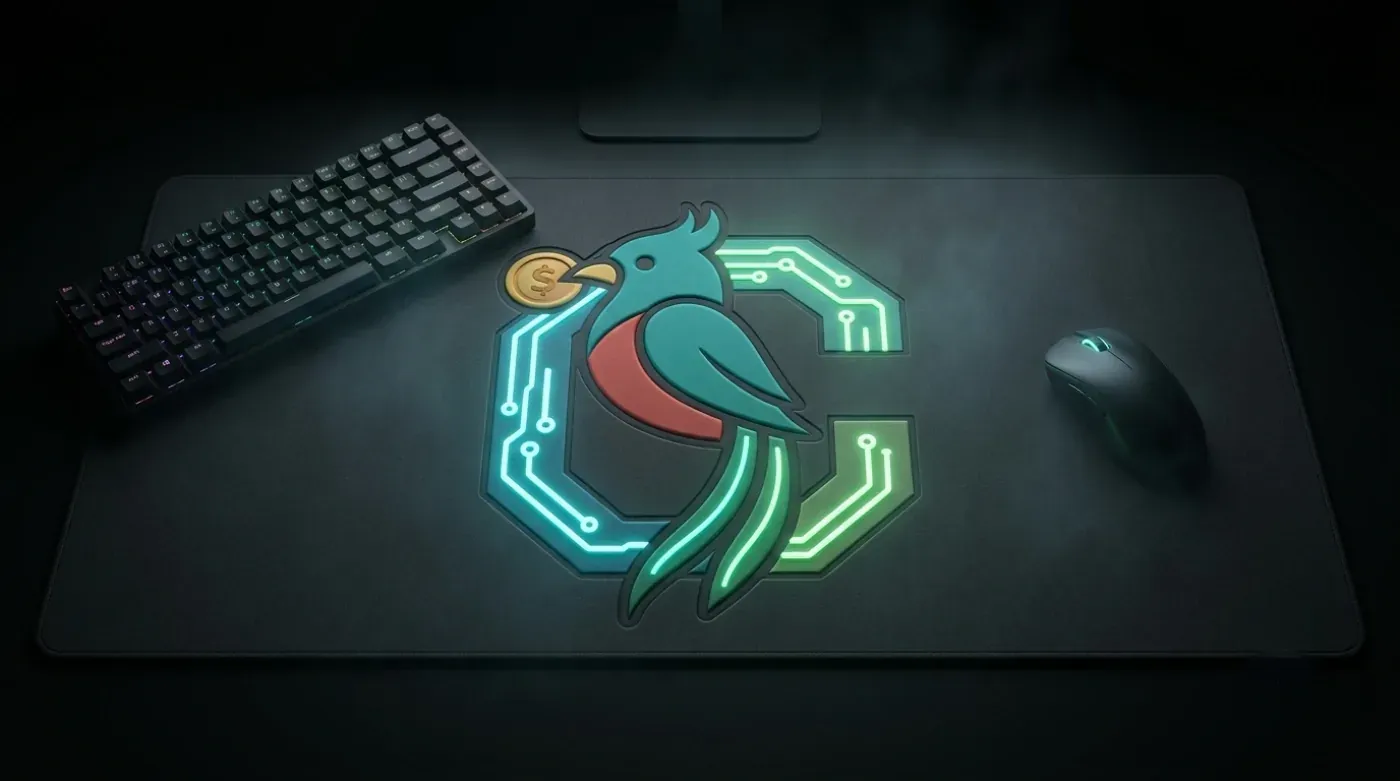
Three colours carry it: a teal drawn from the quetzal’s plumage, a circuit blue, and a lime green for anything that needs to be pressed. The gold coin in the bird’s beak does double duty as the currency reference and as the only warm note in an otherwise cool palette, so the eye lands on it.
Quetzo, the mascot
The character came next, and it needed a reason to exist beyond decoration. Price comparison is a dry errand. Someone arrives mildly irritated that they have to check eight tabs. A guide changes the register of that visit.
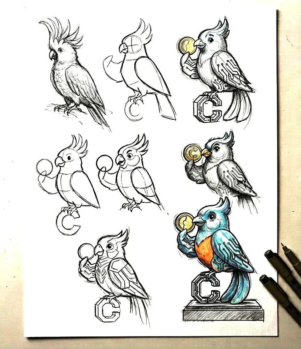
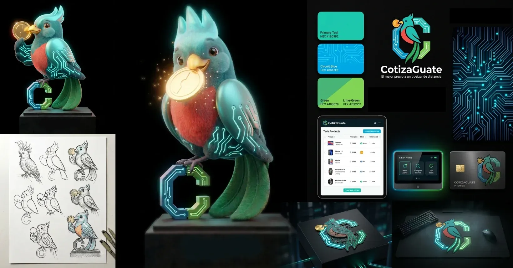
Sketching came before any modelling. Silhouette, proportion and pose get resolved on paper in an afternoon; the same corrections cost days once a mesh exists. The sheet above tracks the move from an anatomical bird to a shape simple enough to read as a brand asset.
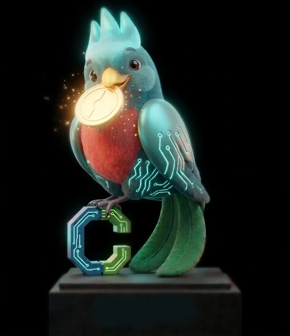
He is called Quetzo, a contraction of quetzal and Cotizo. Short, phonetic in Spanish, and it sounds like a piece of software. His written brief is deliberately narrow: analytical, quick, never wastes your time, and his one job is finding a lower price. Fur and feathers were modelled in Blender, with the circuit motif from the logo carried onto his wings so the two assets read as one system.
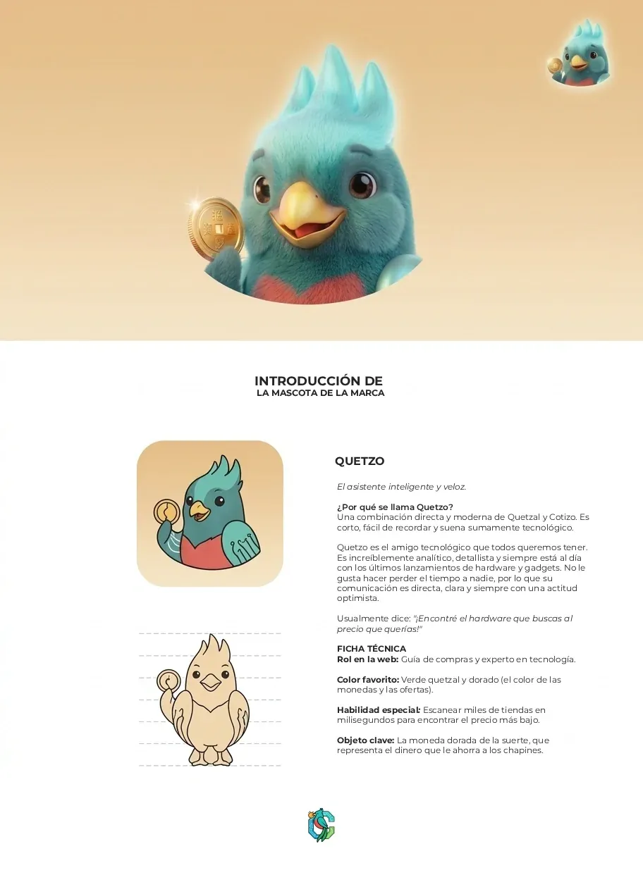
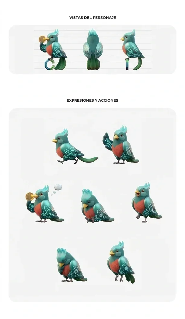
The turnaround and the pose set exist so the client is never stuck. A single hero render is a dead end the first time someone needs the character in a banner, an empty state or a push notification. Eight poses and three views mean the mascot can be deployed without another commission.
Applying the system
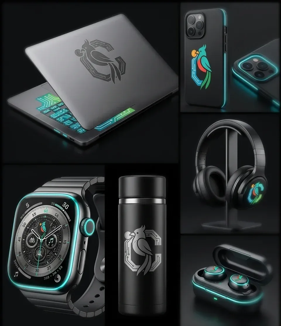
Mockups are how you find out whether an identity actually works. Engraved on a laptop lid the mark loses its colour and has to survive on silhouette alone; on a watch face it drops to a few millimetres; on a phone case it gets the full palette. Testing across those extremes catches the failures a flat presentation board hides.
The storefront
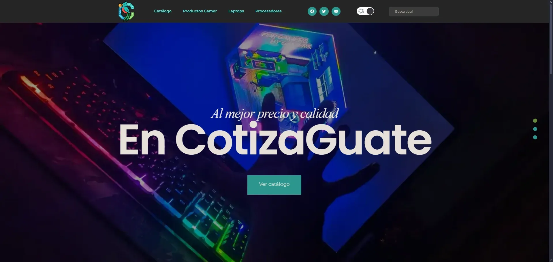
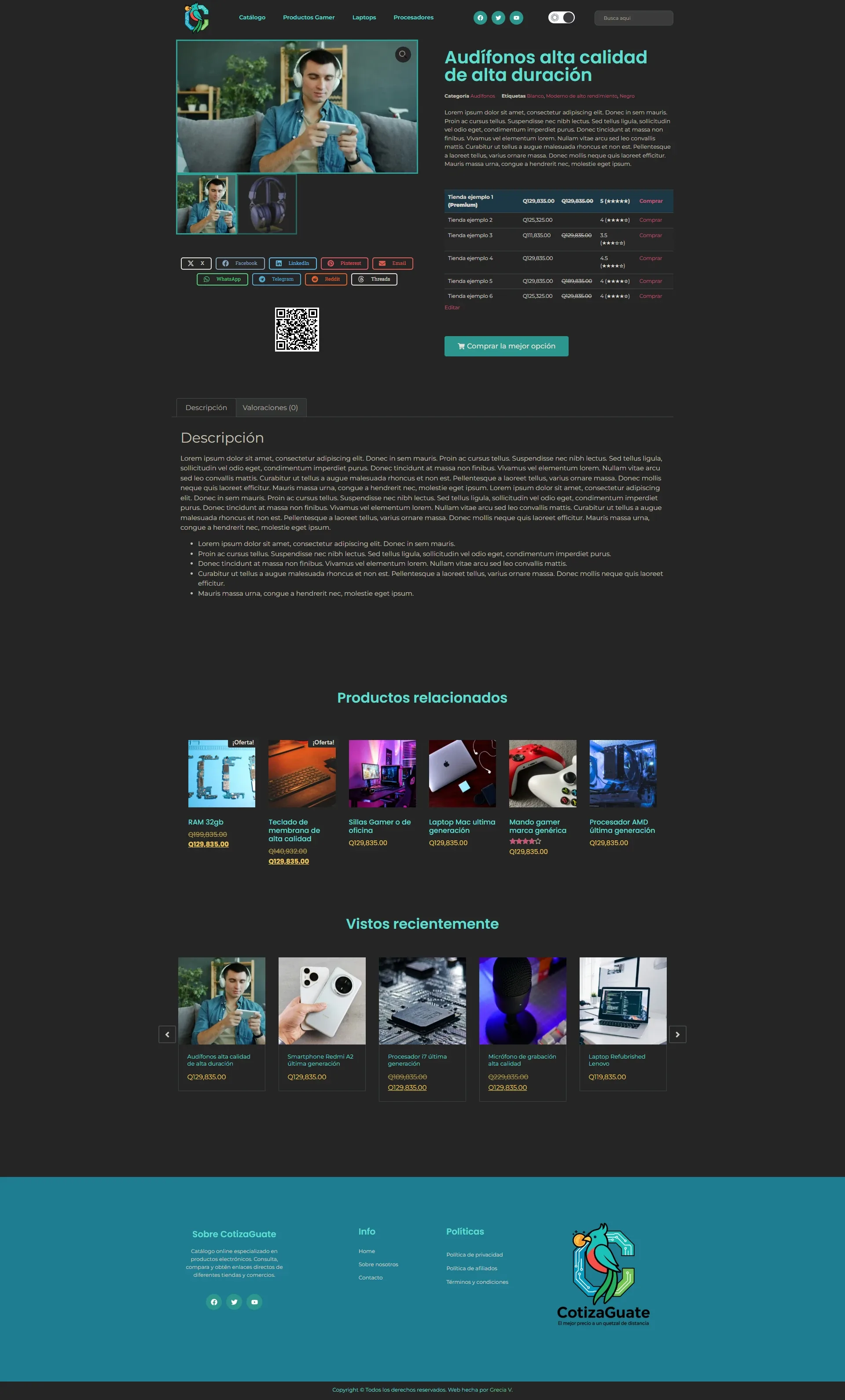
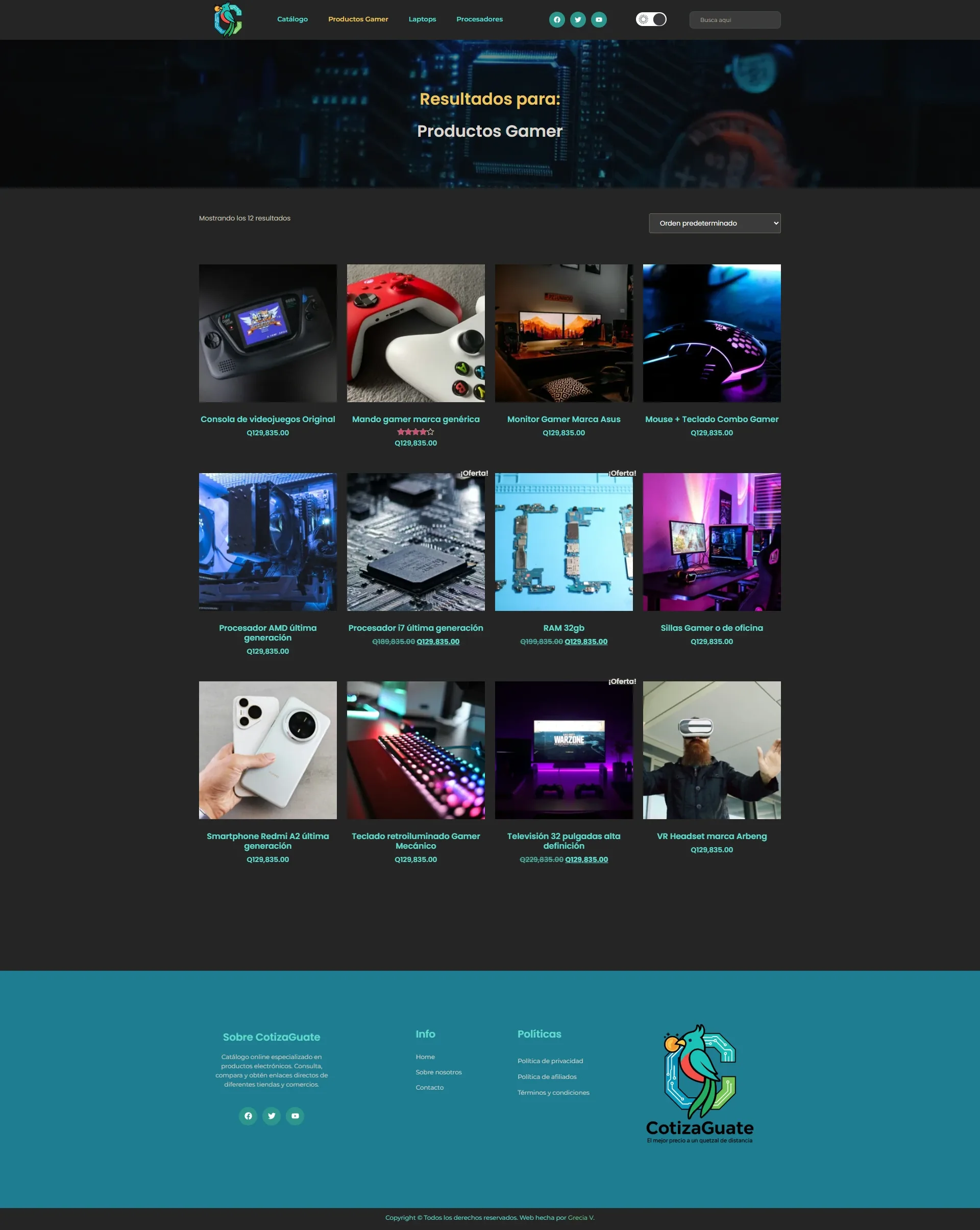
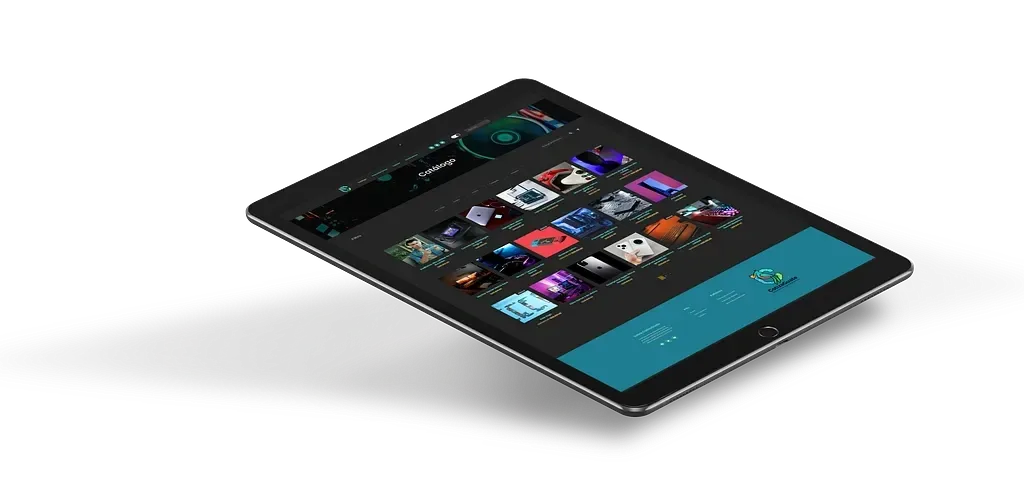
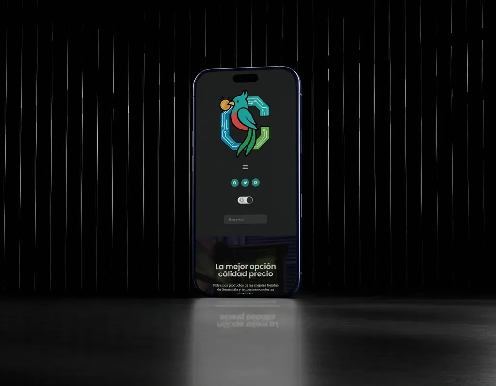
The site runs on WordPress with WooCommerce, built as a template written from scratch instead of a purchased theme bent into shape.
That came from a stated requirement: the client adds and edits products themselves, permanently, with no developer in the loop. A bought theme meets the visual brief faster and then resists every change after launch. Writing the template against the brand’s own type, colour and spacing rules means the editing screens produce on-brand pages by default, rather than relying on anyone remembering the rules.
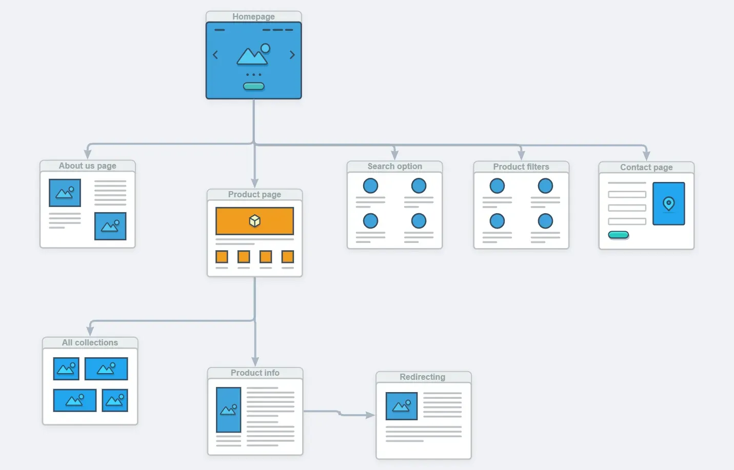
The flow above was settled before any page was designed. It is short on purpose: search, compare, leave for the retailer. Every screen either narrows the options or hands the visitor off, and anything that did neither was cut.
Light and dark themes both ship, with the palette checked in each so prices stay legible either way. On a comparison platform, a figure that is hard to read is a failed page.
Stack
- Blender for Quetzo, from block-out through fur, materials and final renders
- Illustrator for the monogram, wordmark and colour system
- Photoshop for the merchandise and packaging mockups
- WordPress with a hand-built template, no purchased theme
- WooCommerce for the product structure and retailer pricing data
- Elementor for the catalogue layouts the client maintains
Outcome
A young platform that looks established, a mascot the client can deploy without commissioning artwork every time, and a catalogue they run themselves.
Need the identity and the build from one place?
Splitting branding and development between two suppliers is where consistency tends to break. Handling both means the decisions made in the logo still hold by the time they reach the CMS.