
Anywhere Healing: High-Performance Wellness Website Built with Astro
Project Gallery




The contradiction to solve
Anywhere Healing sells products for insomnia and stress. Their previous site took four seconds to become usable.
That is not a performance statistic, it is a credibility problem. A visitor arriving stressed, watching a spinner, has already been told something about the brand before reading a word. The interface had to be the first part of the product, not an obstacle in front of it.
The technical choice
I built the site in Astro, and the reason is specific rather than a framework preference.
Astro ships zero JavaScript by default and generates static HTML at build time. For a site that is essentially content plus a checkout, most of the page needs no runtime code at all. Interactive pieces load only where they are used. The result is a page that is readable almost immediately rather than after a framework boots.
Deployed on Netlify, so pages are served from a CDN close to the visitor. The calm the brand sells is partly just the absence of waiting.
Interface decisions
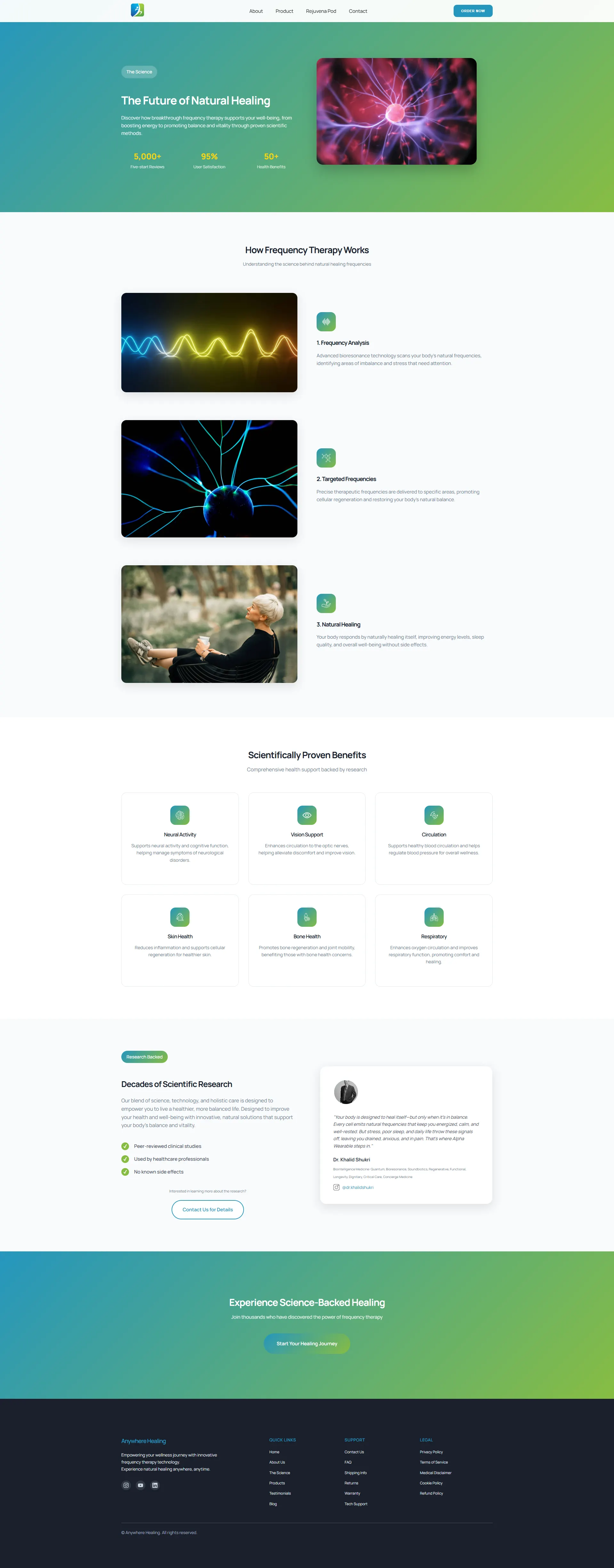
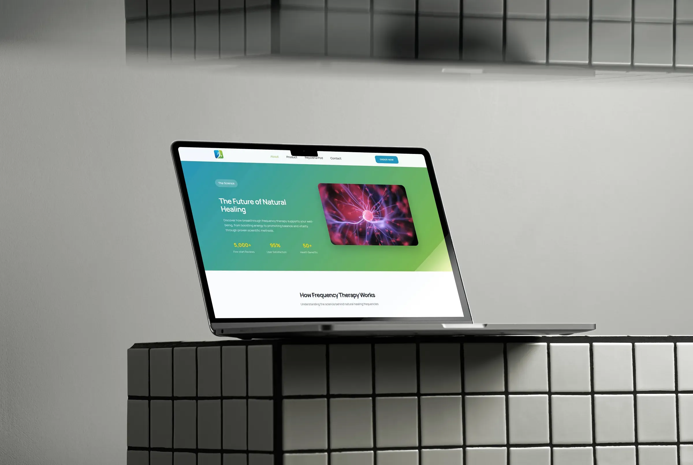
A palette borrowed from chromotherapy. Soft greens and muted blues, chosen because they are what the product itself is about, not because they are fashionable.
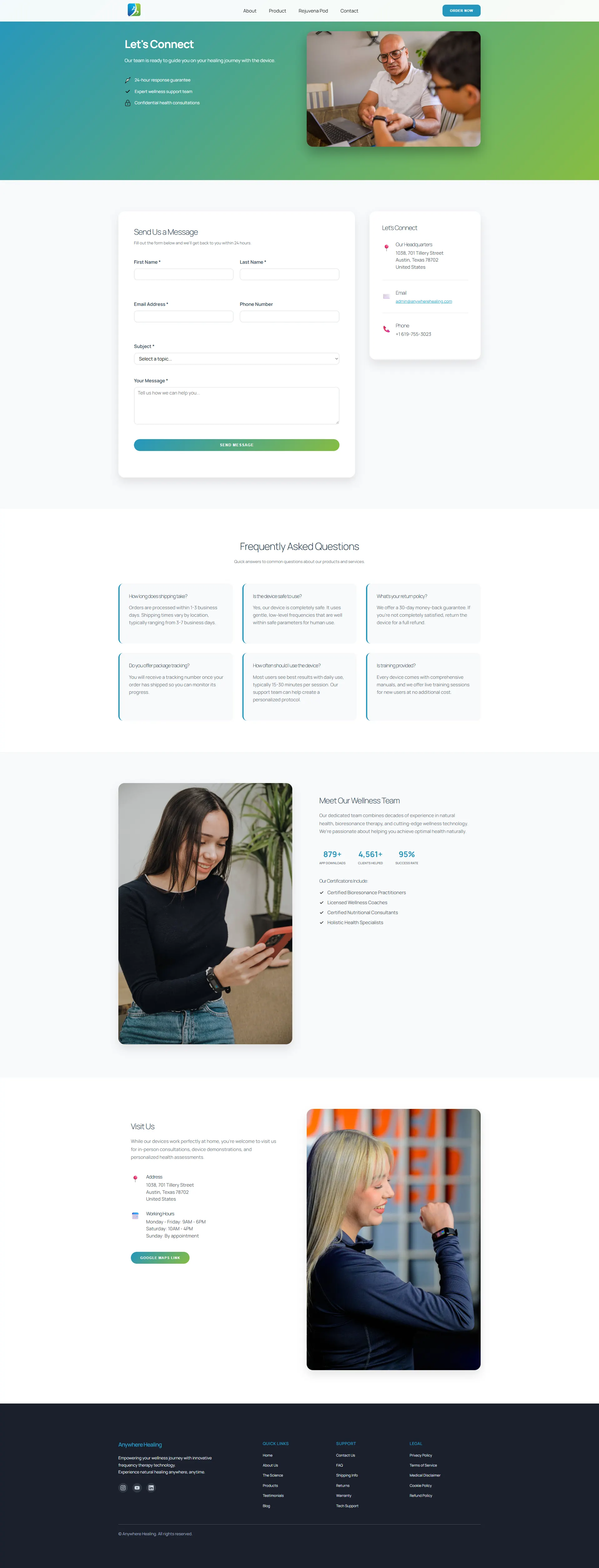
Whitespace as pacing. Generous spacing between sections gives the eye somewhere to rest. On a site aimed at people with sleep problems, density is the wrong texture.
Images sized for their slot. Every asset exported at its real display dimensions in a modern format. Rich photography and a light page are not in conflict if the export is done properly.
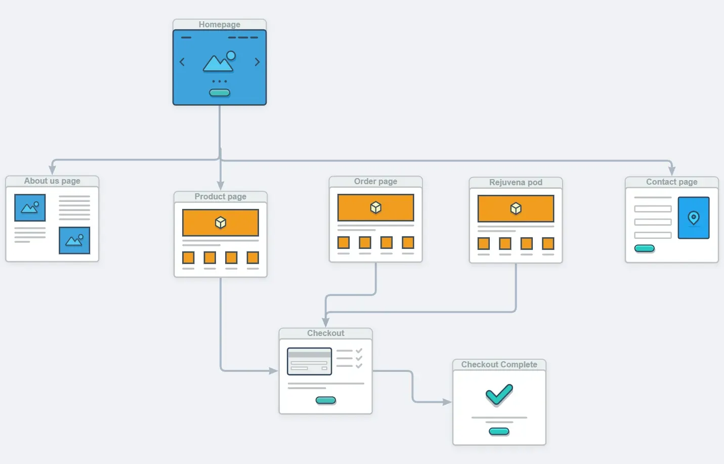
The checkout was the hard part
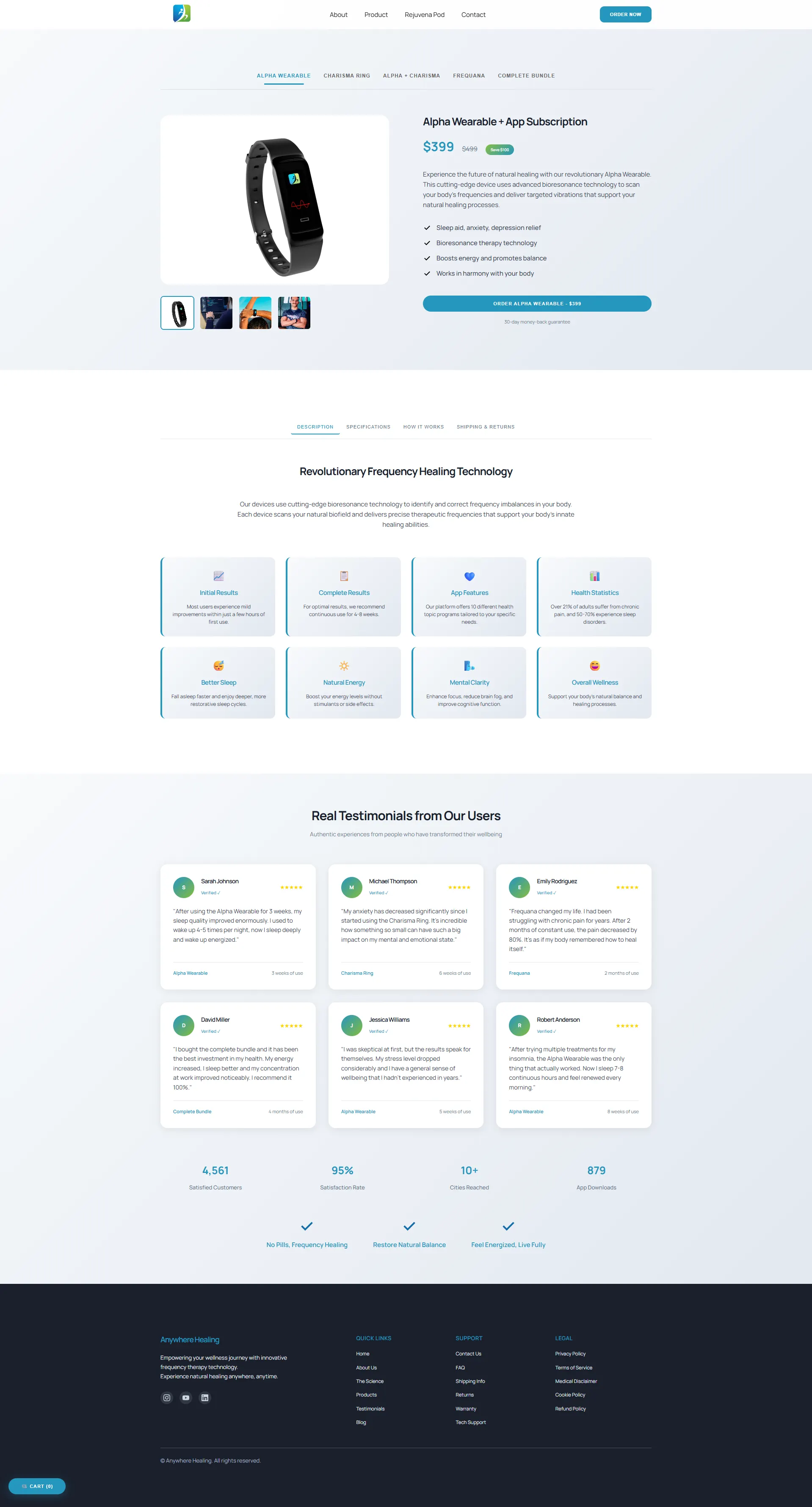
The catalogue has two very different kinds of product. Small wellness items are impulse purchases. The Rejuvena Pod is a considered, high-value device, and its price was the main obstacle to conversion.
Selling both through one flow would have compromised either one. So I built two:
Direct purchase for the smaller items. Straight to payment, no steps in between.
Instalment purchase for the Pod. The buyer chooses full payment or a structured plan, and the interface calculates each instalment live as they change the terms. Seeing the monthly figure rather than the total changes the decision, which is why the calculation had to be immediate rather than revealed at the end.
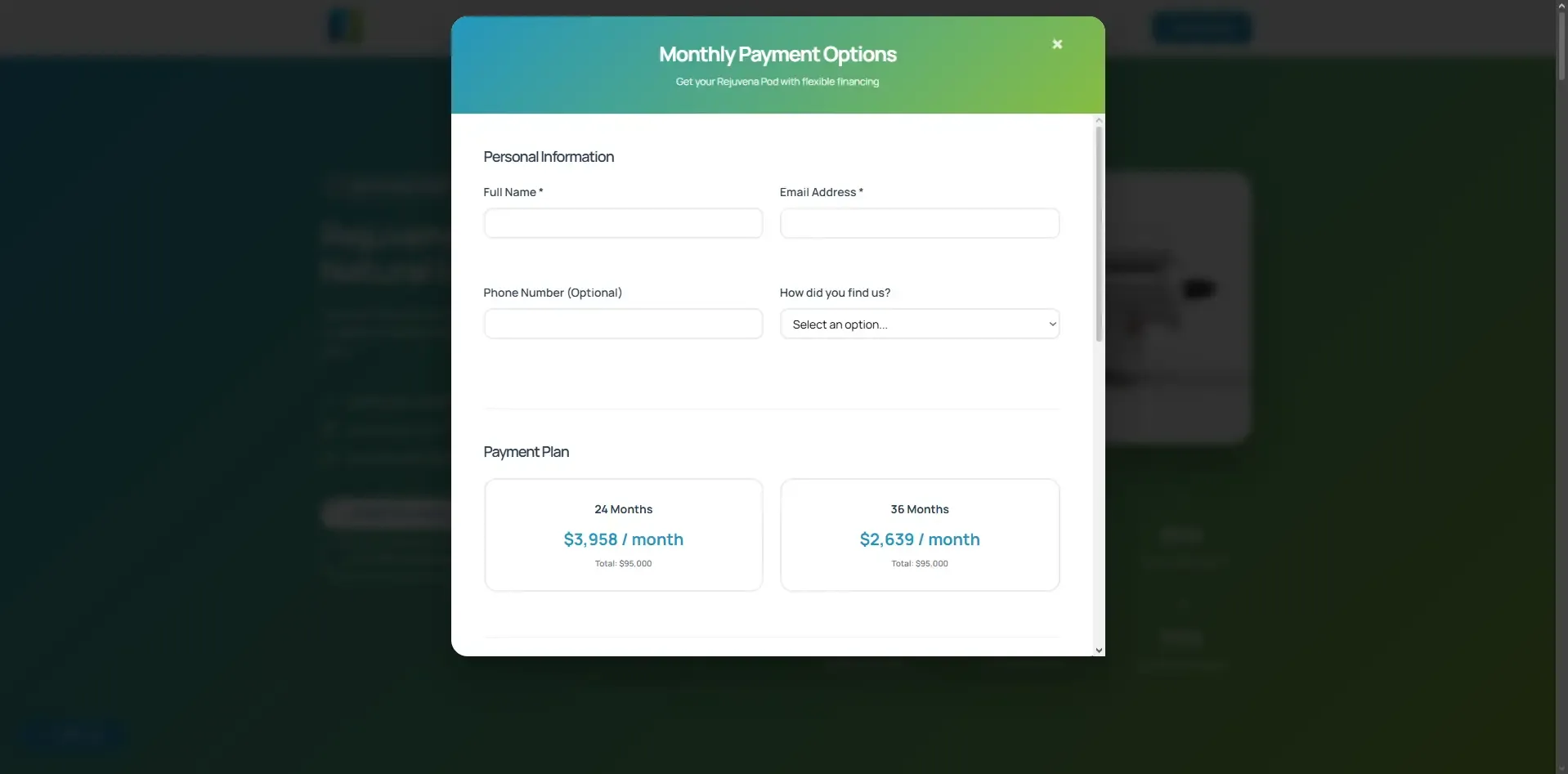
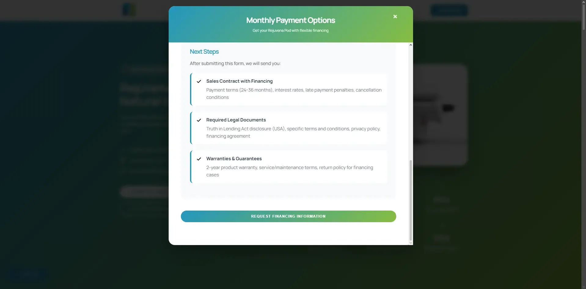
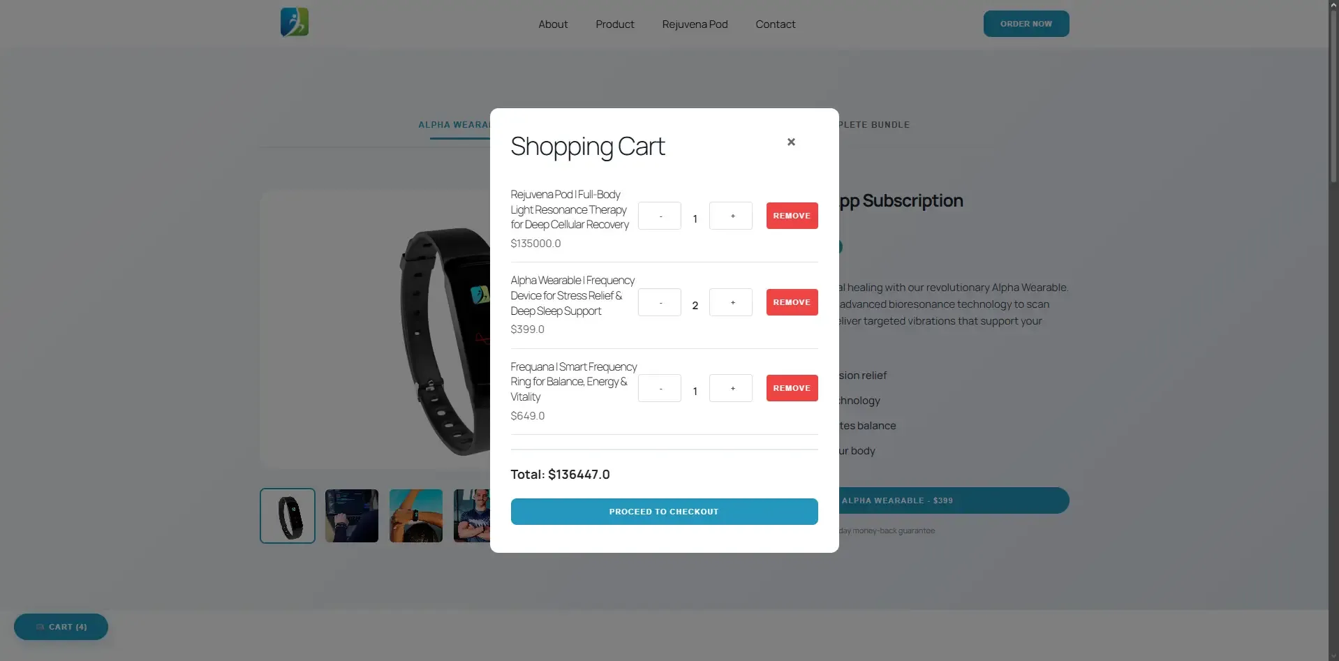
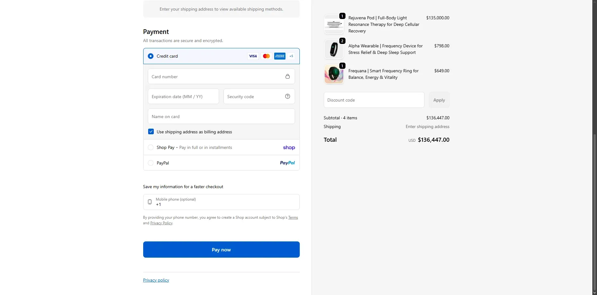
Both paths run through the same encrypted processing tunnel, so the split exists in the interface without duplicating the security surface.

Stack
- Astro for static generation with no JavaScript baseline
- HTML and CSS hand-written, no utility framework, since the design system was small enough not to need one
- Netlify for deployment and CDN delivery
- Custom instalment logic in vanilla JavaScript, loaded only on the checkout
Result
A site whose speed is part of what it is selling, and a checkout that made the expensive product buyable by changing how the price is presented rather than what it is.
Does your site contradict your product?
Wellness, finance and healthcare brands all sell a feeling that a slow, cluttered site immediately undermines. That is a solvable problem, and usually a technical one.