
Alma Street: Marketing & Events Website Design and Development
Project Gallery

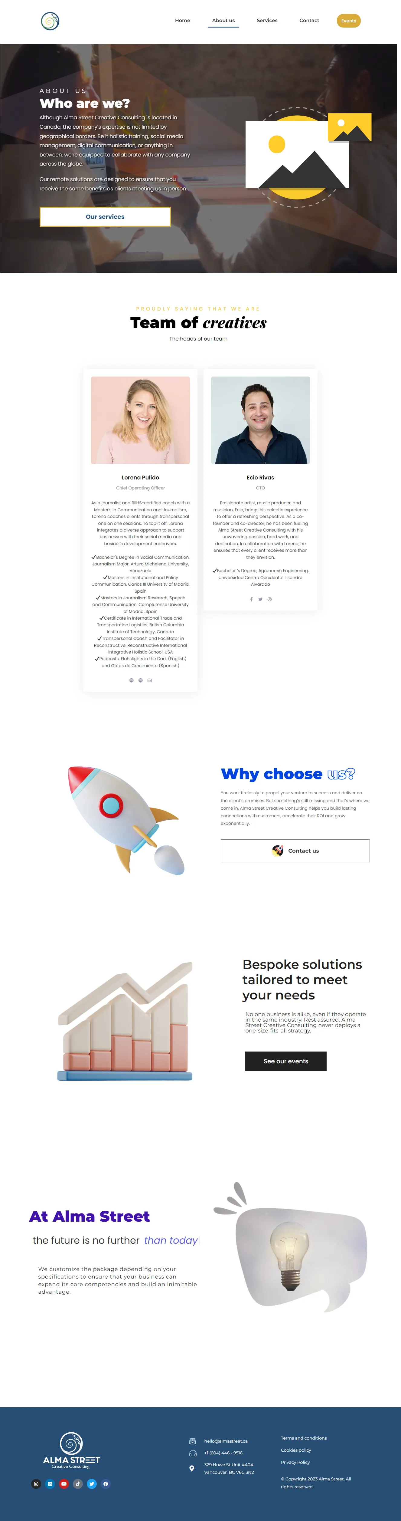
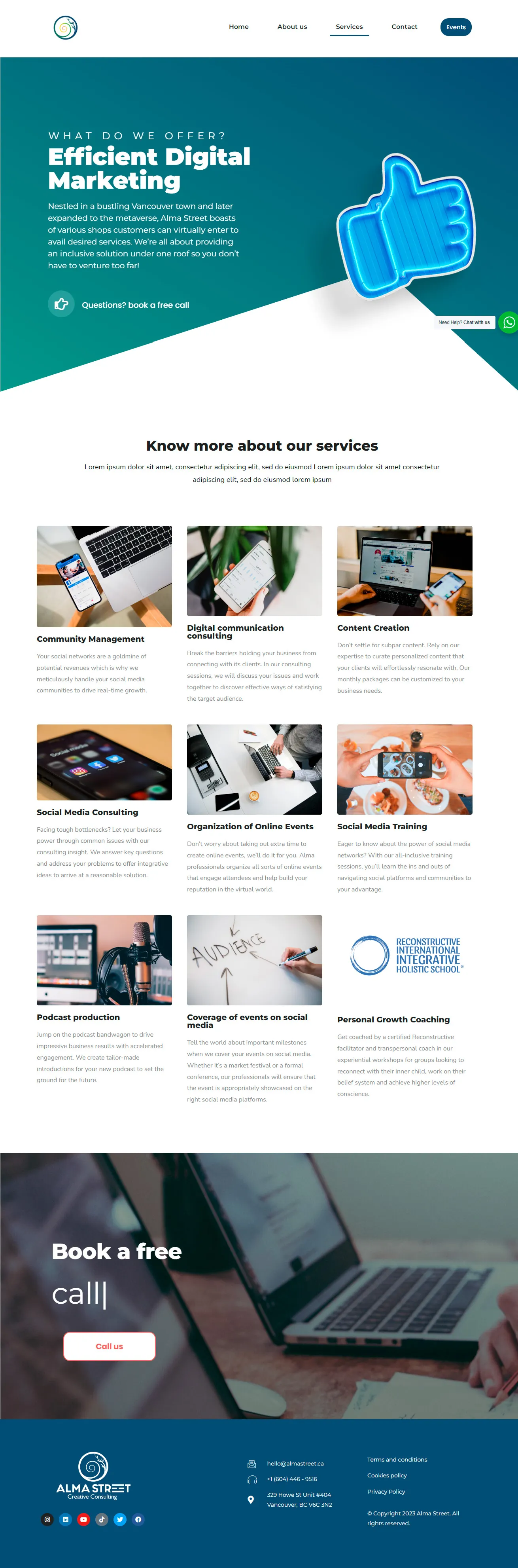
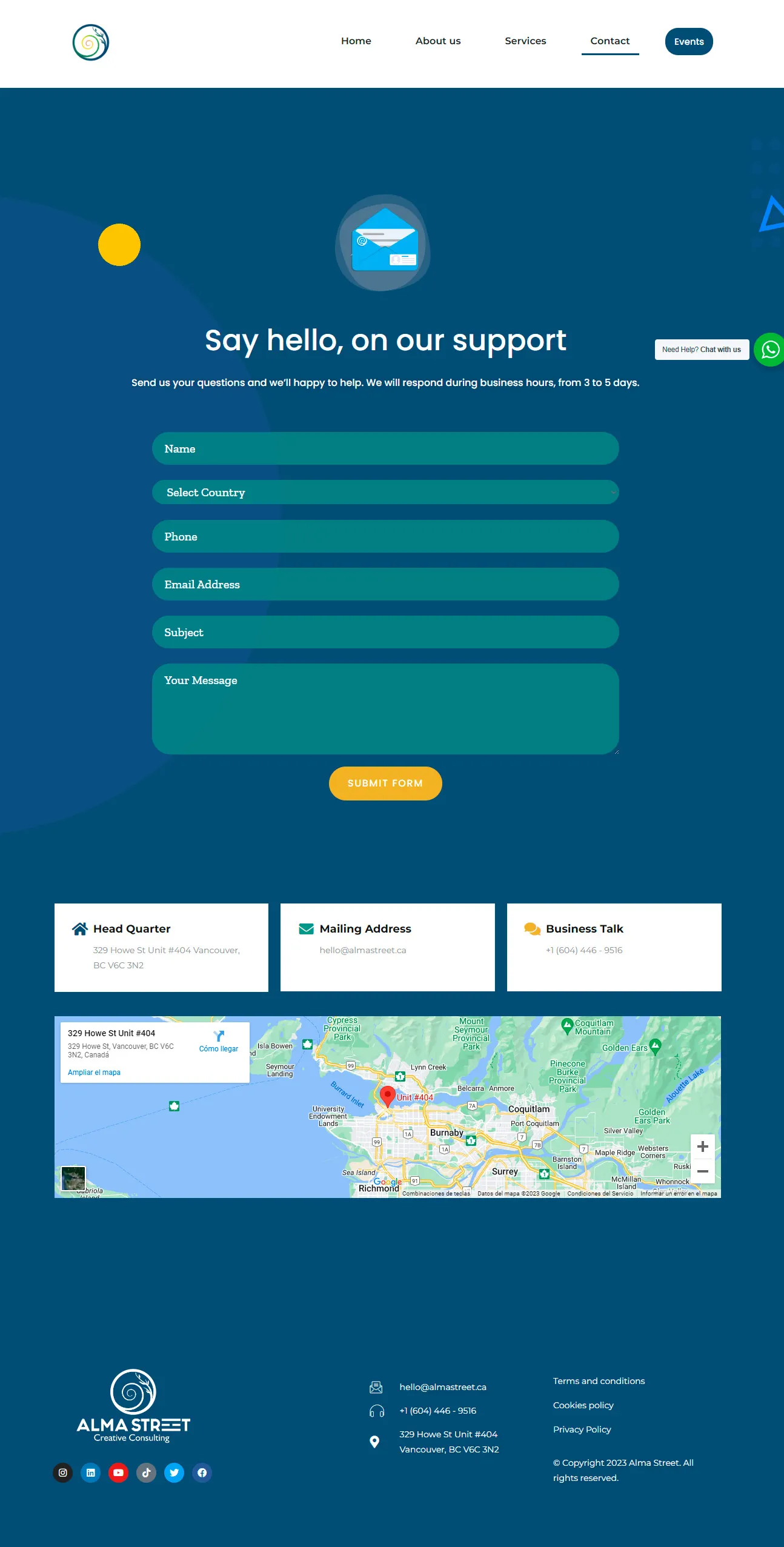
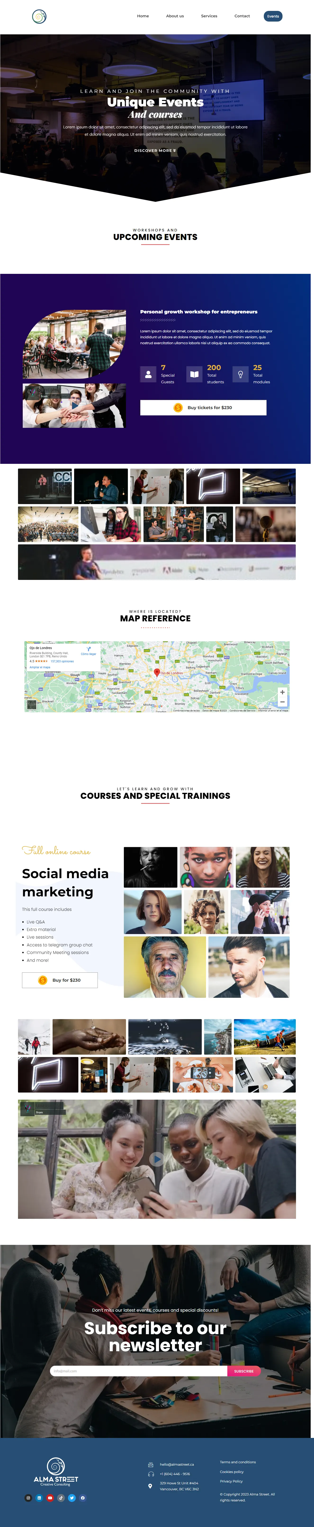
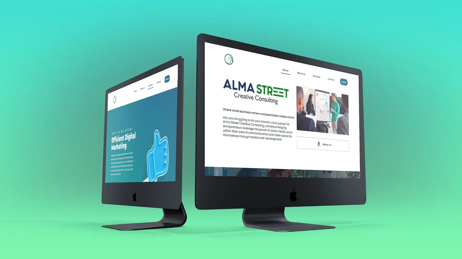
Two businesses, one site
Alma Street is a marketing agency in Canada that does two different things. They sell consulting to companies, which is a slow, relationship-driven sale. They also run workshops, which is a fast, ticketed sale to a completely different audience.
Most sites in this position pick one and bury the other. The consulting page gets the attention and the events end up as a neglected list somewhere in the footer, or the reverse. The design problem here was giving both equal standing without making the home page feel like two sites stitched together.
How I resolved it
Two funnels, one identity. Rather than splitting the site, I built parallel paths that share a visual language but have different pacing. The consulting route is longer and builds trust before asking for anything. The events route is short: see the workshop, see the date, register.
The team as the trust anchor. For consulting, people buy the people. I gave the team section real weight rather than treating it as an obligatory About page, because that is where a prospect decides whether to send the enquiry.
Events as live content, not a static page. The workshop module pulls from a calendar, so upcoming sessions surface on the home page automatically and past ones drop off. Nobody has to remember to update it, which is why most agency event pages go stale.
The architecture
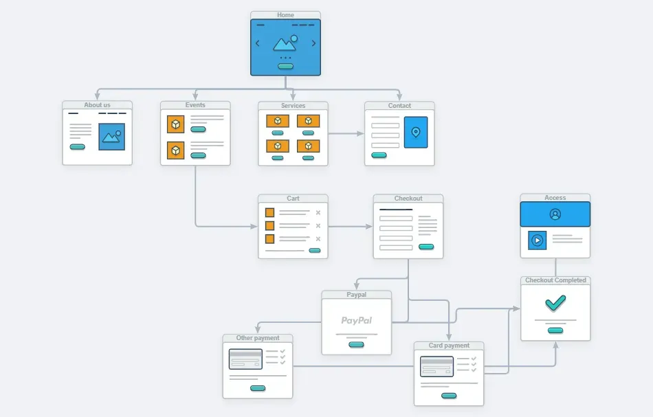
The flow maps four stages, with the two audiences separating at the second:
- Home presents both offerings and lets the visitor self-select.
- About carries the consulting funnel; Events carries the workshop funnel.
- Services and the event listings each go deep on their own terms.
- Contact and newsletter catch anyone not ready to commit, so interest is not lost just because the timing is wrong.
That last piece is deliberate. Consulting sales rarely close on the first visit, and a newsletter signup keeps the agency in front of a prospect until the timing works.
Stack and motion
Built on WordPress with Elementor Pro, with the event calendar and a newsletter integration wired in so both run without manual maintenance.
I added movement carefully: section fade-ins, a subtle zoom on cards, easing on directional transitions. All of it CSS driven and tied to scroll position rather than running on load, which keeps the page responsive on mid-range hardware. Motion here is there to mark transitions between sections, not to decorate.
Result
Both sides of the business have a proper route through the site, and the events section maintains itself.
Running more than one offering?
Sites that serve two audiences usually fail by treating them as one. Mapping the paths separately before designing anything is what stops one of them being an afterthought.